In ecommerce, conversion rate is an important element to consider to help boost your sales and generate more revenue for your business. Although it’s not always easy for brands to optimize their conversion rates, some quick changes can bring significant benefits!
In marketing, we talk about conversion rate optimization (CRO). This is an essential action to generate sales!
Here’s a non-exhaustive list of tips and tools to improve your conversion rate and optimize your online store in order to transform your website visitors into customers, without too much difficulty.
What is the conversion rate on a website?
The conversion rate makes it possible to measure the percentage of people who have performed a specific action compared to those who have not.
These actions can be different and varied:
- purchase of a product,
- subscription to a newsletter,
- participation in a webinar,
- creation of an account,
- request for a quote,
- download of an ebook
- download of a white paper,
- etc.
On websites, conversion rates are very often used! They allow you to have very precise data to know the effectiveness of marketing actions, for example.
Say that you create a dynamic ad on Facebook. The objective of this content may be to increase your number of followers, augment traffic to your website, or boost product purchases for your business.
To know if your ad is effective, it’s important to know how many people convert! But then how do you calculate this conversion rate and how do you increase your CRO, the conversion rate optimization of your website?
How do you calculate and analyze the conversion rate?
The calculation of the conversion rate is very simple.
To return to the previous example, to measure this ecommerce KPI, you just have to take the number of people reached by your Facebook ad, divide it by the number of prospects or leads who converted, and then multiply by 100.
This gives us the following:
(NUMBER OF CONVERSIONS / NUMBER OF VISITORS) X 100
In the case where your ad reached 200 visitors and generated 10 conversions, the calculation is as follows:
(10/200) x 100 = 5%
The conversion rate of your Facebook ad is therefore 5%!
What is the link between conversion rate and user experience?
When we talk about optimizing a website in order to increase conversions, the objective is in fact to optimize the user experience.
We know that if the experience with your online store is positive, the visitor will not only become a buyer but will also be loyal. Before you start, there are four main ideas to keep in mind:
- A site is never perfect. It can be improved indefinitely.
- Your visitors making up the traffic to your website come with different objectives and needs. It’s therefore best to implement purchasing paths that correspond to the greatest number, without overloading the interface.
- The optimization of a site takes place in a highly competitive context that’s also constantly evolving at a very high speed. Making a website evolve, whether you want to increase your ecommerce site speed, improve its technical details, optimize its conversion path, or even modify its purchasing process, means gradually changing the most obsolete elements to bring them up to date.
- It’s necessary to know your site well, to understand and interpret important data relating to how you can improve your CRO, to be helped by a marketing team, and to realize that it’s better to not just rely on your instinct alone.
How do you improve conversion rate in ecommerce?
On large ecommerce sites, making sudden changes to improve conversions can be very dangerous.
Putting all or part of the site online always involves the risk of bugs, malfunctions, and, in the long run, a breakdown in the user experience.
Sales can therefore be automatically and irretrievably lost!
A gentler method can limit these risks for your business when it comes to CRO: progressive optimization.
Where do you start to boost the conversion process?
If your aim is to work on your conversion rate optimization, you may want to use the AIDA model to analyze your website.
Taught in all sales and business negotiation courses, AIDA stands for the following:
- attention,
- interest,
- desire, and
- action.
These four concepts are the four psychological phases that a visitor goes through to be persuaded to buy.
In theory, it’s impossible for a person who buys a product or a service not to go through each of these four stages. Each of them involves what we call "psychological triggers."
If you forget one of them, it’s very likely that the visitor will never move on to the next phase.
Through this study, it’s also easier to understand what can be changed for a better conversion rate.
How do you increase your conversion rate on your ecommerce site?
1. Be clear about your online store
Internet users aren’t patient. As soon as they arrive on your site and take a quick glance at its content, they must immediately understand what they’ll find and if the site can meet their needs.
So be clear about who you are!
In the header of your website, next to your logo, clearly display a slogan that makes it clear what you offer as products or services.
Also make sure that your navigation bar is simple and readable, allowing shoppers to immediately find what they’re looking for and click through to the next step. To do this, it’s better to limit the number of tabs and opt for short titles, written in capital letters, rather than fill this space with an overwhelming selection of options and data.
Finally, use photos of your products on your website’s homepage to further assert your identity. It’s surprising to see that there are still sites where there are no products presented on the homepage. This is the showcase of your ecommerce site. It’s therefore unthinkable not to find content pertaining to products there... Can you imagine the windows of a physical store without any products inside?
Of course, the more your store and your brand are known, the less you need to establish this first point.
Awareness is a key trust factor that allows you to avoid many constraints.
2. Apply the best practices and strategies of seduction
Seduction plays a very important role from the very first moments that the internet user spends on the site. It’s not because you’re the cheapest that you’ll sell.
The objective is to provoke an emotion, even if the exercise is more difficult to do on the internet than in a physical store.
To do this, offer a dreamy presentation with beautiful visuals, magnifying zooms, and an enticing design that highlights your products. Note that your magnetism must also be characterized by attractiveness and excitement in terms of offer.
Here’s an example with the Space NK website:
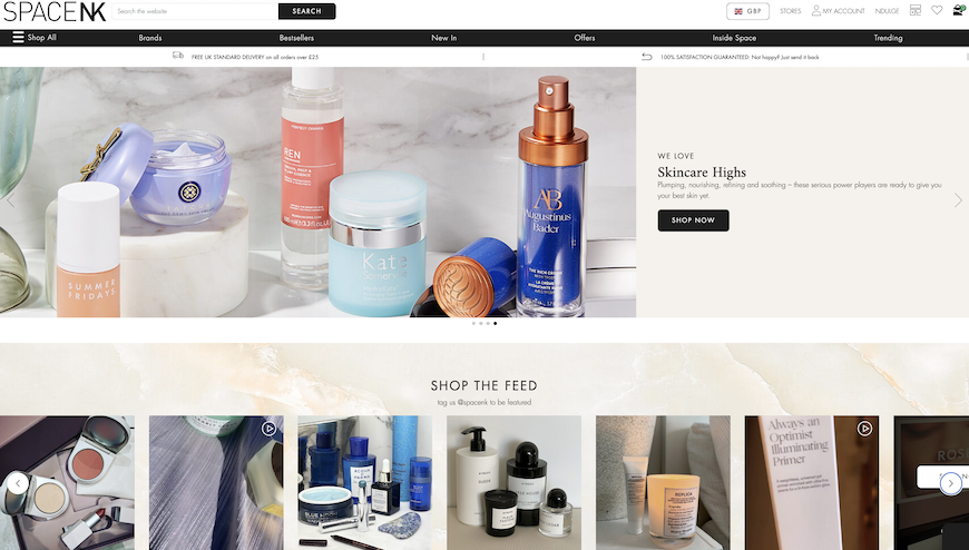
The different visuals entice the eye and captivate the internet user. All these codes are directly in line with the online store’s visual identity.
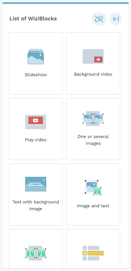
When you build your online store using the WiziShop ecommerce platform, you’ll be able to avail of an easy-to-use drag-and-drop system that allows you to create attractive pages that match your brand image! Here are some elements you can add to build your site:
Try WiziShop free for 7 days
THE EASIEST NO-CODE ECOMMERCE SOLUTION✅ No credit card required
✅ Access to all features
✅ No commitment
3. Offer several entry points to your products and services
Each visitor has different needs, desires, and ways of searching and consuming.
You must be able to respond to this variety by playing on different entry keys.
You can attract them by price, novelty, and security. One solution: use the SONCAS method, a French acronym that when translated stands for Security, Pride, Novelty, Comfort, Money, Likeability, which allows you to meet all the demands of your users.
We will come back to this later in this article.
What are the steps to follow to optimize your conversion rate?
4. Take care of your navigation and do regular tests on your site
The most frustrating thing for a user is to not find what they’re looking for.
And if they eventually do find it, but with many difficulties, they’re not happy. You must therefore take care of your navigation menu. Once again, limit the number of categories (a maximum number of seven categories maximum is recommended).
Create submenus in the form of large retractable panels (layers) that allow you to detail the content of the subcategories.
Finally, avoid having more than three levels of categories on your site.
5. Use faceted filters
The larger your offer, the more difficult it will be for the user to find what they’re looking for.
Moreover, they won’t scroll endlessly or browse all the pages to find a product that appears far away in a category page, which may lead to them quickly exiting your website and increasing your ecommerce bounce rate.
Help them refine their search with faceted navigation. Note that your filters must be finely constructed.
To do this, think about the specific characteristics of each category and try to extract the most relevant criteria in relation to the user's search.
For example, for hotplates, allow a filter by energy type, number of burners, etc.
In addition, don't forget to measure the impact of filters on your sales. If they’re poorly designed, they can have the opposite effect of what you hoped for.
What causes a poorly designed filter? Too many criteria or criteria that are not decisive in the buying act, among others...
6. A search engine that finds
This principle has already been mentioned on this blog.
First of all, your search bar must be visible and easy to find on your site.
Second, your search engine must perform well. This requires a lot of time to finetune and perfect it.
In order for it to be as efficient as possible, you must teach it to handle synonyms and misspellings or to suggest keywords or the most popular searches.
I would even add that instead of presenting an empty results page, display personalized recommendations based on the user's browsing and ordering history.
In addition to over 400 tools to aid in increasing conversions, access to a helpful team of Business Coaches, free ecommerce training, and more, the WiziShop ecommerce solution offers an ultra-powerful search engine for its e-merchants with a predictive search.
Try WiziShop free for 7 days
THE EASIEST NO-CODE ECOMMERCE SOLUTION✅ No credit card required
✅ Access to all features
✅ No commitment
7. Personalize your offer in real time
Now we come to... personalization!
One of the main causes of a low ecommerce conversion rate is that visitors don't find what they want to buy quickly enough.
Again, category pages are often very long, and visitors landing on the website aren’t interested in browsing through the hundreds of products offered or simply don't have a clear idea of what they’re looking for to use the filters.
Personalizing the offer is a very simple way to help users find exactly what they’re looking for, just like a salesperson would do in a store.
However, it should be noted that the user doesn’t know that they’re seeing a page that’s specifically dedicated to them, based on their personal behavior and preferences.
8. Fill in all the information for your customer
To inform the internet user as much as possible about a product is essential on the web, where there’s no salesperson like in physical stores.
For this, the means are quite limited. It’s therefore necessary to take advantage of all the information you have to allow the internet user to form the most precise and complete opinion possible of the product.
You can do the following:
- take care of the texts of the descriptions,
- increase the number of product photos,
- use customer reviews, and
- use video or 3D shots to make the product even more attractive and almost tangible to internet users.
With this point, in addition to the need to search easily, you’ll also meet the visitor's need for reassurance about what they’re buying.
Entice your visitors
9. Break the price barrier
Price is a powerful factor of attractiveness. If your brand policy is based on a pricing strategy, make it known!
Highlight your prices. Show them off and indicate through an appropriate design that the customer is bound to get a good deal.
On your homepage, don't hesitate to use different graphic variants to display the prices and play with the label "Top deals," "Promo," etc. Of course, be careful to respect the legislation in force for your particular area.
10. Play on the SONCAS method
Here we go again! The SONCAS method is a strategy that involves managing the commercial approach of the customer based on their character.
Your product pages can be designed to take into account each character of your customers.
The questions to ask yourself are the following:
- Do you emphasize the novelty effect enough?
- Do you play on it enough?
- Will the product improve the user's comfort?
- To what extent is this visible on the product page?
All these criteria can easily be highlighted on a product page in order to improve its language for internet users and increase your online sales.
Reassure your prospects
Once the internet user has been enticed by your offer, you just need to reassure them!
Several levers are sensitive to this subject: delivery, returns, stocks, customer service, product quality...
For this last point, as we’ve seen, it’s the information and visual elements provided in the product pages that will reassure. For the others, let's see what can be done.
11. Inform about the delivery
Information about ecommerce delivery times and the returns policy must be placed in a very visible place on your website.
It should be included in your reassurance line, on the product page, and/or in the shopping cart.
The faster you answer these questions, the faster your customer will be freed from this anxiety, specific to online sales.
Delivery costs must be displayed as soon as possible in the order process, i.e., at least in the shopping cart.
At this stage, the customer has not yet created an account but they’ll have an idea of the total price of their order and will be able to compare with your competitors.
If you mention the delivery costs in the purchasing funnel, you’ll likely obtain some information at the time of account creation, but this can represent a significant obstacle.
12. Inform about stocks
Transparency is the key word on the web, especially in the age of social networks.
Be honest and clearly display the availability of a product or a possible delay in delivery, if any.
This will help to optimize your ecommerce checkout process, and your business’s e-reputation will also be better!
13. But who owns this site?
You must absolutely reassure visitors about your identity and say who you are.
For example, you can put photos of the employees, founders, after-sales service team, etc.
And in this regard, clearly display the customer service number to promote the peace of mind of the internet user. They’ll be more likely to make a purchase from your website if they see that they can contact someone easily in case of a problem.
Why can the rate drop and how can it be improved?
There are numerous reasons why e-merchants may find that their conversion rates are dropping. That being said, when working on your business’s CRO, there are often simple changes you can make to start seeing your conversions increase.
14. A simple registration form
Keep it as simple as possible. Ask customers only for what is necessary.
Contrary to popular belief, registration is not the right time to enrich your marketing database. In reality, the simpler and quicker it is for the user to fill in the form, the faster they’ll complete the order.
Limit the amount of information that needs to be entered wherever possible. The objective is to help, or even assist, the user to fill in their information.
To do this, display clear and visible error messages, correct in real time, pre-fill the fields when you have the possibility...
Graphically, it’s best for you to enlarge the size of the fields users click on to provide data on your website.
All these tips are even more important on mobile. On this type of media, it’s best to use adapted input formats: a numeric keypad for a postal code, for example.
15. Easy choices
For delivery choices, the trend is also toward simplification. Make them easily comparable for visitors and potential customers landing on your website.
Clearly display the benefits of each and also clearly relate them to their price.
An incomprehensible delivery schedule will drive your visitors away. Be as clear as possible about delivery times and announce delayed delivery times.
An earlier delivery than expected gives your business’s customer an incomparable pleasure.
Above all, for CRO, it’s essential to respond to the desires of each type of customer.
While some people are willing to pay more for faster delivery or for their order to be delivered on a Saturday when they’re sure to be home, others have no deadline requirements but want to pay as little as possible.
16. Ergonomics, to help hold on to users
It’s important to pay attention to the ergonomics of your website as a whole, but even more so to your purchasing or conversion funnel.
The slightest error can create a doubt in the user's mind and make them either postpone their order or worse, push them to abandon their cart and head to Google to research one of your competitors who may be able to offer a better experience for customers on their website.
To remedy this, note that you’ll need to do some testing on your website. Perform an audit of your store, reviewing your content and each process, and test the experience you provide users to see if there are any problems in the purchasing funnel.