When it comes to About Us pages, every word counts and first impressions matter!
Although often overlooked, the About Us section of a website is essential to online retailers.
It’s this section that informs users about your business's history, mission, and core values. The About Us page is therefore a true platform centered on you, a great space to express your brand and explain to visitors what your business is all about.
In fact, it’s often this page that can allow you to start to create an emotional bond with your potential customers or future clients. It’s the opportunity to help build loyalty and inspire trust with people visiting your online store.
For these reasons, it's important to give your About Us page some TLC and fill it with your best arguments that’ll serve your branding!
In this article, we'll provide a few tips to help you craft an About Us" page that not only tells your story but also captivates your audience. In addition, we'll take a look at some stellar examples you can use for inspiration.
Whether you’re a startup sprouting new roots or a seasoned player in your industry, creating a vibrant About Us page is your ticket to connecting with your audience on a personal level. So, let’s get those creative juices flowing and turn your About Us page into a masterpiece of engagement and charm!
Create a key page, like the biography in a book
As the owner of an ecommerce business, there are all kinds of ecommerce tips that you’ll want to keep in mind. One important item on your checklist will be that you’ll need to work on your branding and thus develop the essence of your brand.
You’ll have to consider your professional social networks and your business cards as you start to build your ecommerce brand. You’ll also certainly think about your online marketing strategy and your different campaigns for Facebook Ads or even Google Ads.
As you build your brand, remember that content marketing is a crucial ingredient to the recipe for ecommerce success, don’t hesitate to check out our article on some excellent content marketing examples out there for extra inspiration.
First things first, though…have you thought of creating an About Us page that resembles your brand image, focused on your qualities?
This About Us page should describe your actions, your strengths, the size of your company, and your background. It should also help with your SEO.
Fortunately, when you build your online store with WiziShop, you’ll be able to design a great About Us page that you'll love, one that’s completely customized to your brand. With our unique system involving Pages+ and WiziBlocks, you can modify the design to suit your unique needs and taste, crafting a page that truly reflects you and your business!
That's not all... with our plethora of design templates, you can craft a complete website, adding all the text, image, and video content that you like, allowing you to start to share and sell your company's product offerings.
Our powerful AI tool makes it possible for you to generate product descriptions for your product pages, FAQs, translations, blog posts, and other kinds of text content for your website in the blink of an eye, saving your business loads of time!
In addition, over 400 pre-integrated features await you, with examples being tools to assist with your email marketing, boost your average order value at checkout, improve your website's technical SEO, and much more.
To help you along your ecommerce journey, our team of Business Coaches is available to assist you with any question you may have. In addition, we offer free training in the form of video tutorials, making it possible to learn more about a variety of ecommerce-related topics and work on these different areas for your business.
Start your online sales adventure with WiziShop today by signing up for a 7-day free trial!
Try WiziShop free for 7 days
THE EASIEST NO-CODE ECOMMERCE SOLUTION✅ No credit card required
✅ Access to all features
✅ No commitment
What is the best way to write a corporate About Us page?
All too often, e-merchants feel obliged to fill out a page that they don’t necessarily understand the full power of.
However, more than an obligation, the About Us page is a fantastic space of expression that allows you to highlight your professional advantages compared to competing sites.
It’s at this precise point that you’ll reach the people who you’ll transform into buyers, perhaps even into ambassadors.
Your About Us page is where you must define precise objectives; thus, this page is going to be a quality commercial aid for your company's success.
It’s therefore essential to take the time to build this page well.
Here are some great examples of good questions to ask yourself to structure your page:
- What is the size of your business?
- How long have you been in the industry?
- What led you to create your project?
- What is your background?
- What makes your company so special?
- What are your core values, what gets you going every day?
All this information is an integral part of your project. These are the arguments that’ll weigh in the balance for consumers.
Choose the right title
Of course, an About Us page doesn’t have to be called that. It’s up to you to customize the title and adjust the language of the copy that you opt to include on the page.
Depending on your arguments, you might choose one of the following effective examples for this text:
- Our story
- Who are we?
- Why choose us?
A single title to establish your identity!
You can also use it to aid your website in ranking for interesting search queries for SEO.
Your story: Your company presentation
There are many ways to tell your story to site visitors on your About Us page.
Here, as you work on the design and layout of the page, it’ll be a question of structuring your thinking and your communication around the DNA of your brand.
It should serve your ecommerce store and convince prospective customers to buy the product that they saw on your homepage by building trust.
These visitors already like the product and think your store is nice… They only need these few elements that’ll create an emotion in them, a feeling of belonging.
Storytelling: How do you write your business’s story for the About Us page?
This is where excellent storytelling comes into play.
Storytelling is a marketing method based on narration. In other words, it’s the art of communicating by appealing to people’s emotions as they read the thoughtfully crafted text in your About Us page.
This technique is therefore conducive to writing your story and creating your dedicated page, such as with the following examples:
- Introduce yourself: We’re based in Portland, Maine...We’ve created...
- Explain the problem that your business wants to solve: We found that...Price quotes were excessive in our field...
- Describe how you’ve carried out this adventure: Since...We're proud of the path that we’ve taken...
- Describe how your solutions address the problem mentioned above: This is why we’ve created tailor-made support...
- Explain the axis of development that you have chosen for the future, where you want to go: Today, we want to...
In your About Us page, you can also opt to include a bit of your personal story in the text, allowing the potential customer visiting your website to learn more about who you are and what motivates you. Just remember to stay professional!
Humanize your company
Don’t hesitate to highlight your team members online with an image or a video!
It’s an opportunity to give a face (or several!) to your brand, and consequently, to add a human touch to your business!
- Your mission: what is the mission that thrills you every day?
- Your buyers: who are they? Can they recommend you?
- Your team: They’re the face of your employer brand and provoke sympathy. They’re also the support offered to your customers.
Your website's social proof
Enhance your reputation
Your reputation is, of course, your first showcase.
Even on your About Us page, the power of your company's reputation and image must be readable.
This page should show your customer reviews and simultaneously show the satisfaction rate obtained.
Your values must also be designed to convey a strong sense of belonging, a lifestyle linked to your brand, for example. Your prospects carry your brand, and it’s necessary to make it known, because they themselves will likely be proud of this fact too.
It’s up to you to promote it!
Here are a few ways to boost your social proof through the text and other content on your About Us page:
- UGC: User-generated content is your best weapon! This type of content to share is produced by your buyers who position themselves as ambassadors. Often of high quality, it allows you to create a universe around your brand. In addition, since it’s based solely on the love that your customers have for your products, it’s free!
- Consumer reviews: Your best showcase! Happy consumers are the assurance of a brand that reassures, that makes you want to trust. Opt for a third-party review tool to show your good faith, like Trustpilot for example!
- Your contact information: Stay reachable and available! Being available inspires proximity and trust from your customers. In case of a problem or simply in case of a request for information or a quote, the user will be delighted to be able to contact you quickly. Simply include a a map, a phone number, and an email address on your About Us page!
The law of attraction
User-generated content is a keystone in your marketing plan for your website. Your About Us page should reflect your consumer reviews, your press releases, and, if possible, quality UGC on your social networks.
The hardest part will certainly be to find the right combination of arguments so as not to give too much information, which could overwhelm people reading your copy.
Think about your About Us page as an added value that must be persuasive and therefore an attractive overview of your identity, your services, and your products in the first place. Just because you seek to attract online shoppers doesn’t mean that seriousness should be missing from this page.
Catch the eye of your visitors with a visually appealing layout design, accompanied by titles, subtitles, images, or videos. Opt for bulleted lists to convey your ideas well to people on your site.
Don’t hesitate to quote key figures that make sense for your company. Present your team in a dynamic way, such as by broadcasting a video or sharing an infographic that’s easy to read and understand to help people learn even more about your business.
In addition, think about creating interaction with your visitors on your About Us page, adding call-to-action (CTA) buttons to generate subscriptions to your newsletter, for example.
Inspiration for how to design an About Us page: Best company examples
1. ZIWI
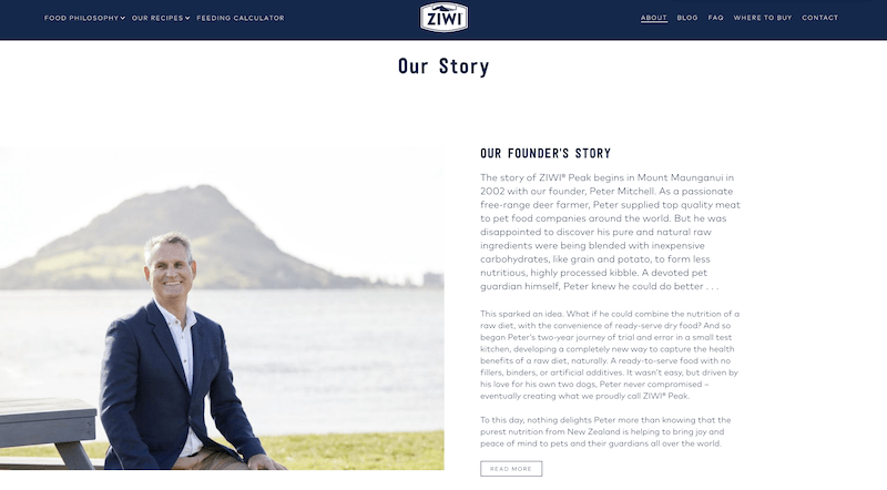
- Founder’s story
Highlighting the origin of the ZIWI adventure is an integral part of the marketing strategy of this pet food company based in New Zealand, as they make a point to state that the brand has stayed true to the founder’s vision since the very beginning.
Detailing the founder’s passion not just for creating high-quality pet food but also for New Zealand and its agriculture, this introduction makes potential customers want to be part of the adventure.
ZIWI speaks to pet owners’ desire to provide their furry friends with the best food possible to create a strong adhesion with their target audience.
- Explanation of approach
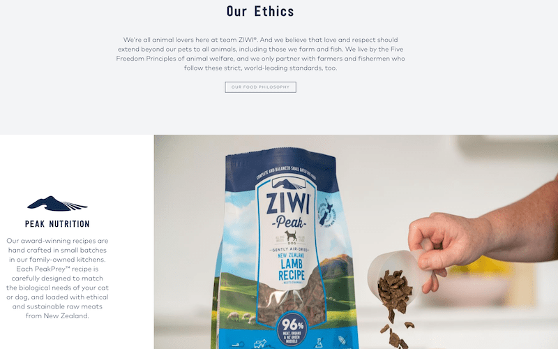
As in any marketing action, ZIWI’s main message should be striking.
What is your activity? What do you do? Where do you want to bring your customers? What are your solutions to the problems encountered by users?
The brand answers all these questions perfectly, and in a very efficient way. Clarity is the key!
- Achievement and your evolution
Each new step in your story is an accomplishment!
Consider indicating the key dates of your adventure in your own country but also internationally. Highlight your successes. They’re what make you proud and what will make your prospects want to buy and take part in the adventure.
2. Sézane
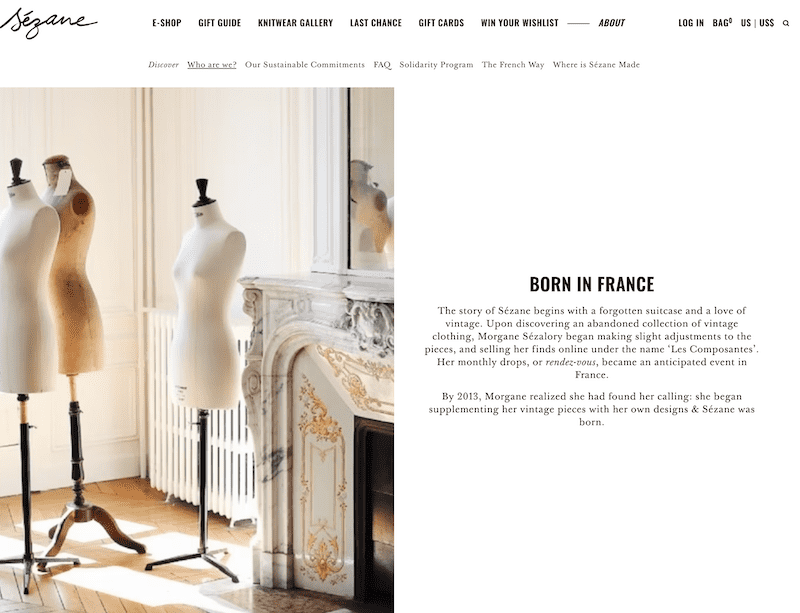
If, like Sézane, your brand wants to be classic and timeless, then opting for minimalism will certainly be your first choice. However, think about finding a happy medium between too little and not enough.
Sézane, for instance, uses a two-part page. In the first part, the brand highlights its DNA by evoking its French ties and objectives.
In the second part, Sézane presents its founder, Morgane Sézalory, as well as her creative approach that led her to launch her ready-to-wear label.
3. SHEIN
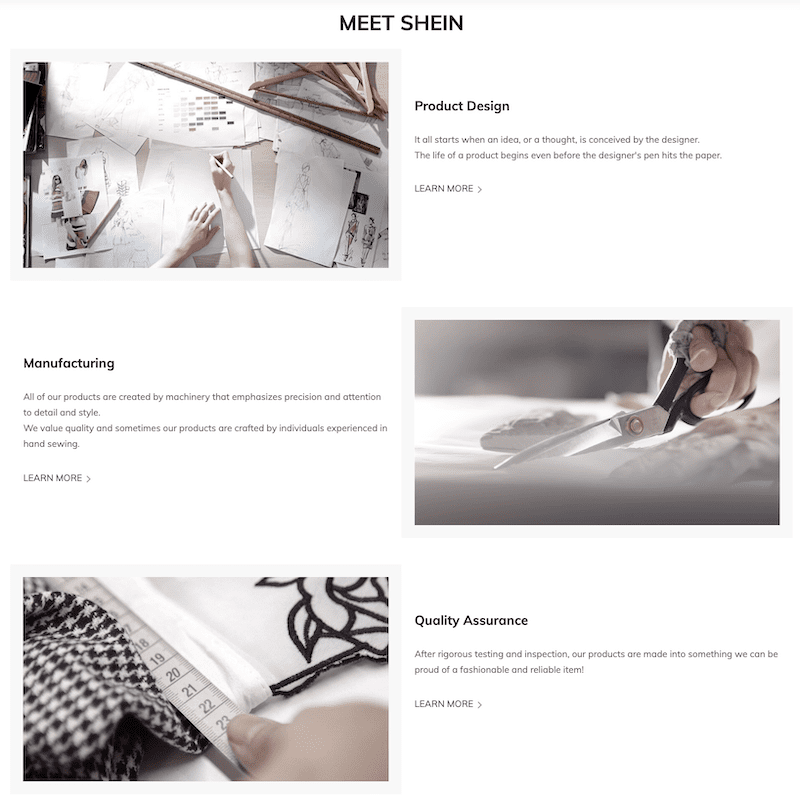
For this ready-to-wear brand, the About Us page presents all the activities performed internally to ensure that the business always offers optimal service.
This page also tries to reassure consumers around the world because, in the beginning, the warehouses were based only in China. Now international, SHEIN presents itself as a reference in the world of clothing with photos of its premises to bring the customer closer to the reality of the field.
4. Orange
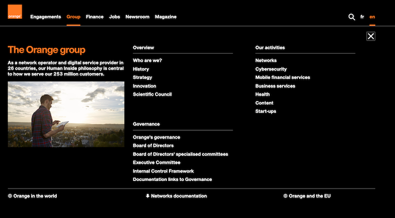
In the case of the French telecommunication network giant Orange, the “Who are we?” page is a part of the site in its own right, with different tabs. This is because the actions of the group are multiple.
In your case, if your actions are present in different sectors, don’t hesitate to multiply the pages of the About Us section, as if you were dealing with a mini-blog on your site.
5. YETI
The About Us page on YETI's website is another great example because it makes effective use of a clean design along with storytelling, connecting the brand's origins to its current ethos. The narrative begins with the founders' frustrations with traditional coolers and their journey to creating a durable, high-performance product.
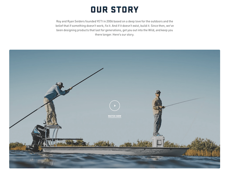
This story not only highlights the quality and innovation of YETI products but also resonates emotionally with the target audience, making the brand's purpose and vision clear. This approach enhances customer engagement by making the company's history relatable and its mission admirable.
Scrolling further down the page, visitors can learn about the brand's ambassadors, discovering their unique stories and experiences.
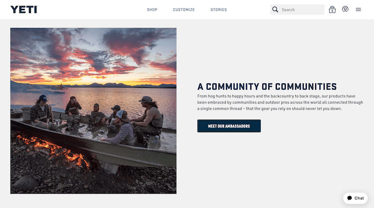
This in turns helps YETI foster a sense of community and build a stronger connection with potential customers.
6. Petco
Petco uses a comprehensive and engaging approach for its About Us page, starting with a strong statement about the brand's commitment as a health and wellness company for pets, setting a clear mission.
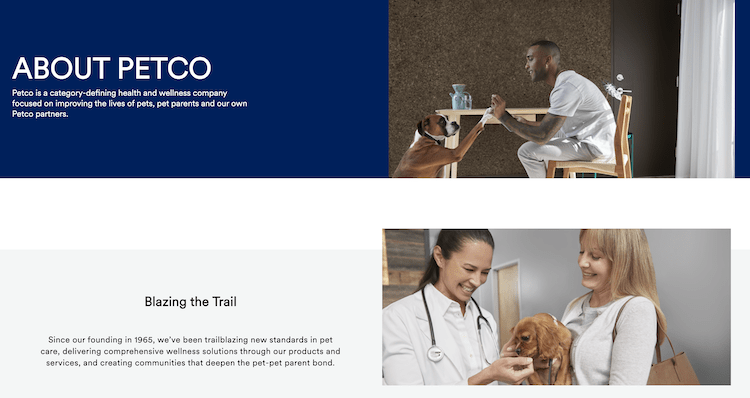
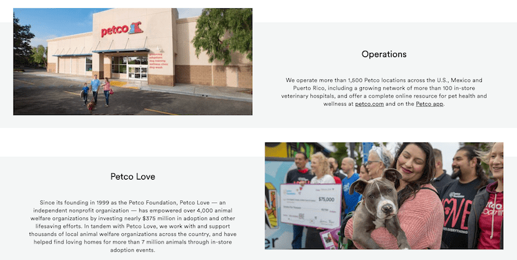
The page features a detailed history that emphasizes innovation and community involvement, reinforcing their dedication to pets and their owners. Furthermore, the inclusion of their achievements with Petco Love showcases their impact on animal welfare, enhancing credibility and strengthening a deeper emotional connection with readers who love their animal companions.
7. Hermès
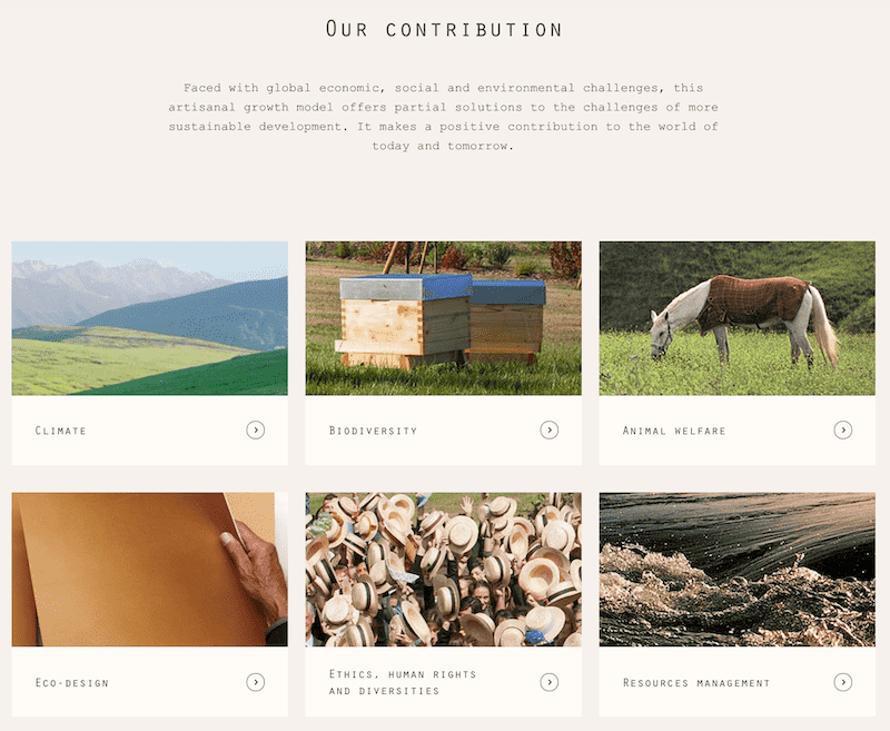
For the luxury house known as Hermès, it’s a question of highlighting the main assets that forge its DNA: its independence, its family spirit, and its respect for tradition.
The presentation page uses images to illustrate the characteristics of the Hermès success story, with corporate photos and illustrations created by artists associated with the company.
If your visual content features high-quality photos, videos, drawings, or archives, put them forward. Beautiful visuals are better than a wall of text to attract internet users.
8. Herbivore
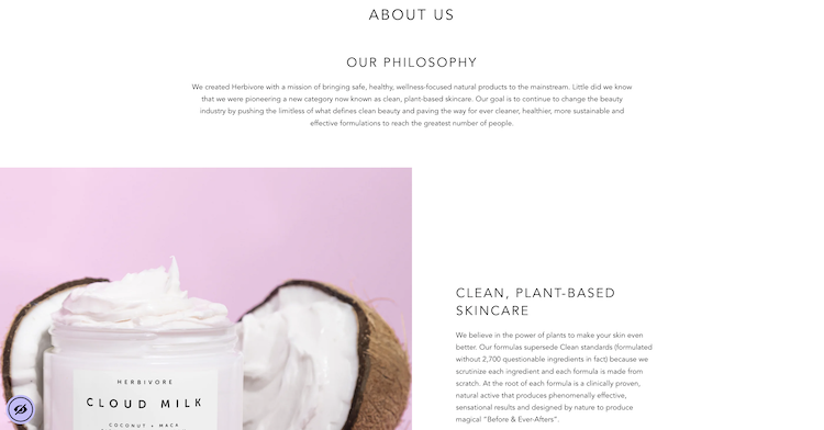
Herbivore's About Us page does a stellar job of communicating their commitment to creating safe, non-toxic, and highly effective skincare products. The page is compelling because it blends personal backstory with a clear, mission-driven focus on sustainability and ethical sourcing.
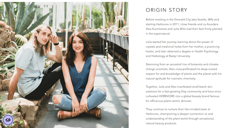
The use of aesthetically pleasing visuals and transparent detailing of ingredients enhances trust and aligns with consumer values prioritizing purity and environmental care. This storytelling approach not only informs but also connects emotionally with visitors.
9. Courir
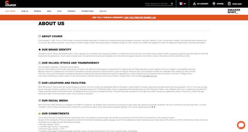
For the French multi-brand streetwear company Courir, the About Us page lists the most fundamental points. Through this page, the brand reveals its positioning while offering reassuring information, like the date of creation and the number of sales points of the network.
Think of the internet user who doesn’t know you and put yourself in their shoes: what details could make you choose this site rather than another? Include all the necessary characteristics to reveal all your qualities as an e-tailer in a few lines: be clear and precise!
10. Pela
Pela, a company that sells sustainable phone cases, prioritizes effective storytelling and clear commitment to sustainability in its About Us page. It begins with a compelling origin story about the founder's experience with ocean plastic, which personalizes the mission and emphasizes the brand's eco-friendly mindset.
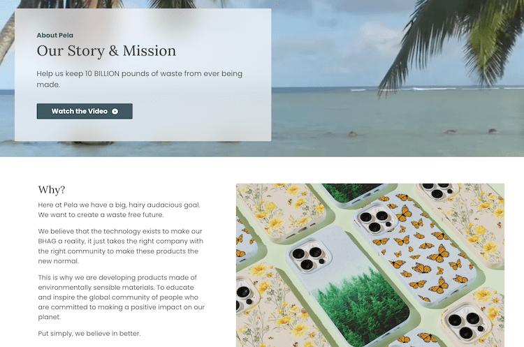
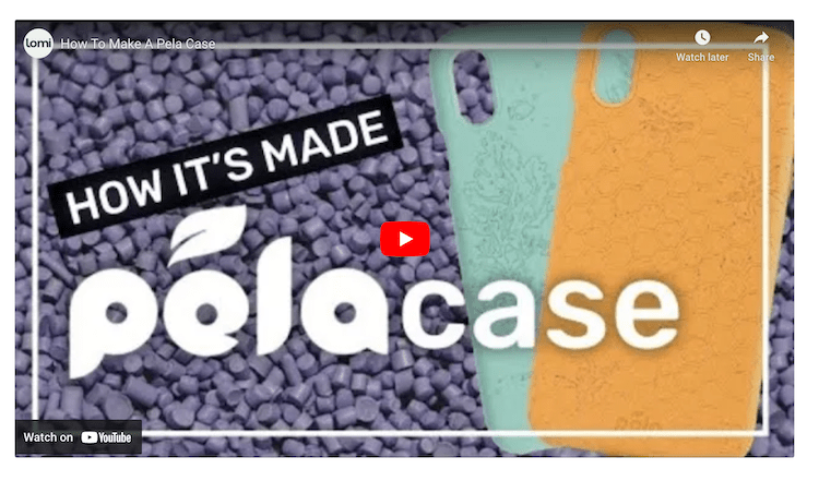
The narrative is supported by strong visuals and engaging content that outlines the impact of their actions and products. The page also features a video that people can watch to learn how Pela cases are made, along with a CTA at the bottom of the page, guiding readers to sign up for the organization's email list.
Taking a personal and mission-driven approach, Pela not only defines the brand's purpose but also builds a deeper connection with consumers who value environmental responsibility.
11. e.l.f.
Beauty brand e.l.f.'s About Us page shows that inclusivity and empowerment are priorities for the company, reinforcing the idea that beauty is for everyone.
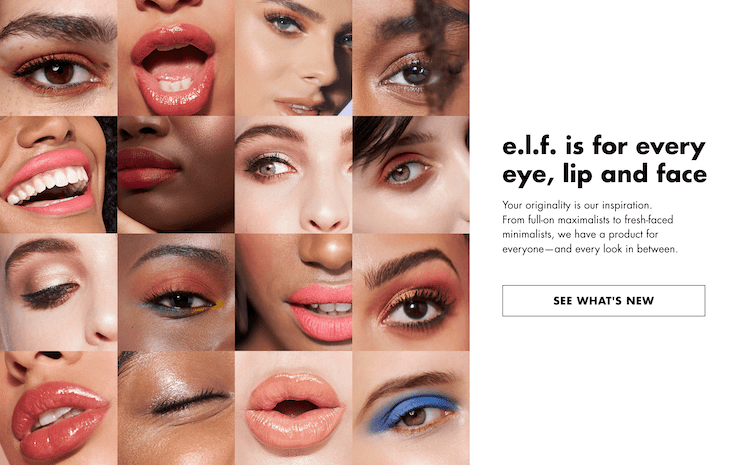
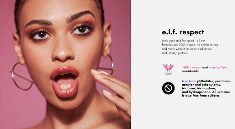
This is demonstrated via their commitment to creating affordable, high-quality, vegan, and cruelty-free beauty products, which takes center stage on this part of the company's website.
The page also adds social proof by sharing user-generated content featuring people using e.l.f. products.
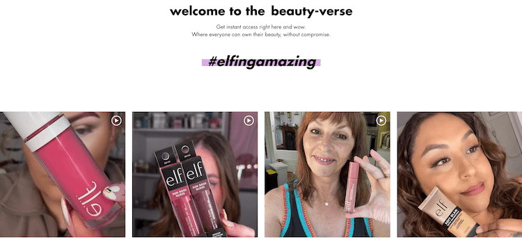
This blend of mission-driven content and user-oriented design, along with a friendly tone and vibrant visuals make it an exemplary About Us page.
12. Adobe
On Adobe's About Us page, visitors can discover the company’s innovative spirit and its focus on the future.
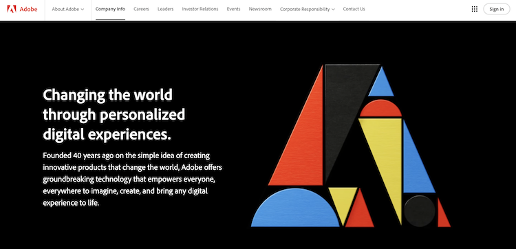
The page thoughtfully memorializes co-founder Dr. John Warnock, illustrating Adobe's appreciation for its roots while also highlighting their drive toward pioneering digital solutions.
Furthermore, emphasis on AI technologies like Adobe Sensei and Firefly showcases Adobe's commitment to advancing creative and business processes through cutting-edge tools.
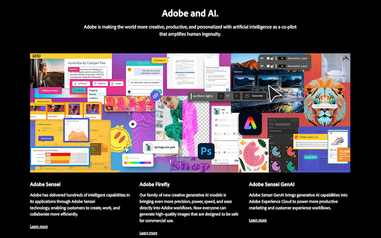
The inclusion of their values and purpose effectively communicates a forward-looking, responsible corporate ideology, making the page a top-notch representation of Adobe's brand and trajectory.
13. LEGO
Making people of all ages happy for over 90 years, LEGO does a very good job of showcasing the company's rich history and core values centered on creativity and quality on its About Us page. It begins by highlighting their motto, "Only the best is good enough," underpinning their commitment to excellence and positive social impact.
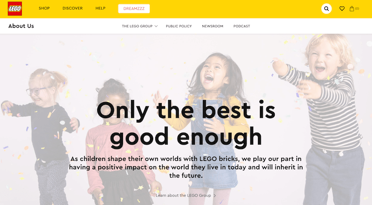
The page narrates LEGO's journey from its inception in 1932, emphasizing innovation and the timeless appeal of LEGO bricks in unlocking children's potential.
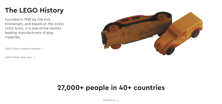
Engaging visuals of children and LEGO models, along with their global reach and educational initiatives, reinforce LEGO's mission to inspire and develop the builders of tomorrow.
14. Moz
When it comes to building an About Us page, the best way to go about it is to structure it in a way that makes sense for your company. For SEO software provider Moz, this means creating different sections to discuss various elements to share, such as the brand's story, culture, and team.
The narrative explains Moz’s origins as SEOmoz, detailing its evolution from a blog to a leader in SEO software.
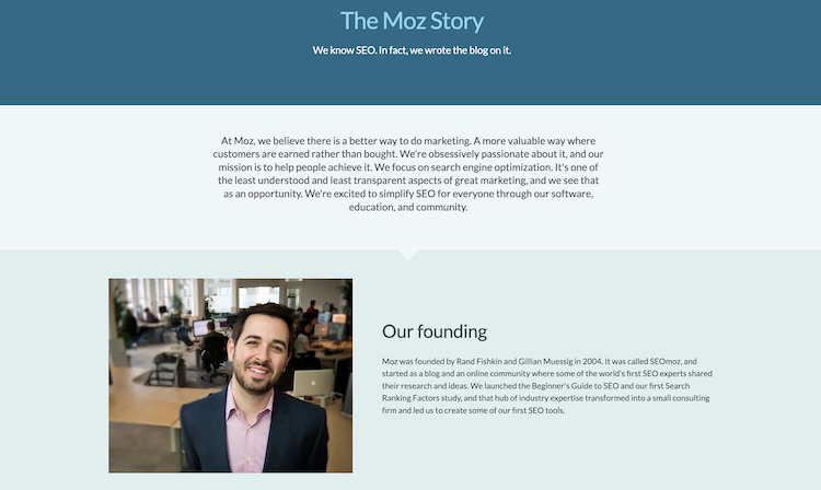
The page clearly conveys their commitment to transparency in SEO and customer-centric innovation, showcasing their pivot back to core competencies in search engine optimization after exploring inbound marketing. It’s engaging, informative, and aligns perfectly with their mission to demystify SEO for everyone.
15. Allbirds
Looking at the About Us page for Allbirds, the brand skillfully blends their unique origin story with a strong commitment to sustainability.
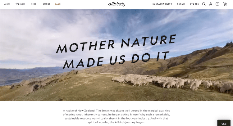
Here, visitors can find out about how the company started with a simple idea inspired by merino wool and evolved into a major footwear brand. It emphasizes their innovative approaches to using natural materials and highlights their achievements like achieving B Corp status.
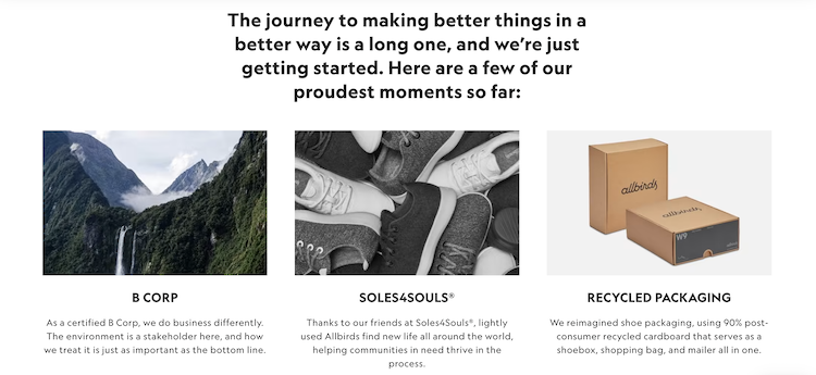
The commitment to recycling, community support through Soles4Souls\u00ae, and minimalistic packaging reflects their eco-friendly ethos, effectively connecting with consumers who value sustainability.
16. TWOTHIRDS
When you've got authentic passion for an idea or a cause, you'll want to be sure to highlight it on your About Us page, as this can strike a chord with visitors and help them feel more connected to your organization!
A great example of this is the sustainable clothing brand TWOTHIRDS with its clear communication of the company's eco-conscious mission and innovative practices. It effectively uses the story of its founding, highlighting the personal journey and passion of the founder, which adds authenticity and relatability.
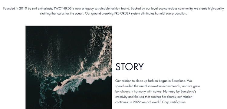
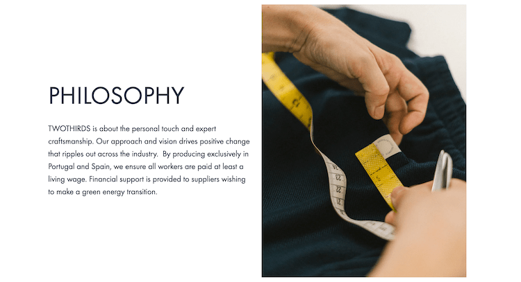
Featuring large images and plenty of white space, the page details their sustainable practices and community engagement, strengthening their brand identity as environmentally responsible. This narrative not only informs but also inspires readers, aligning the brand with like-minded shoppers who prioritize ecological health.
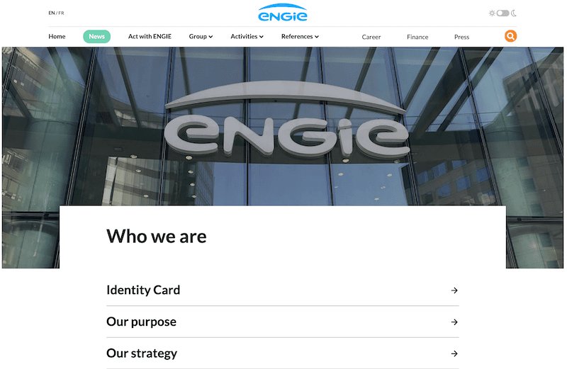
17. Engie
In the case of the electricity supplier Engie, the aim is to reassure future customers about the core values of the company. In several tabs, the page targets key characteristics, also including current events as well as all the answers to consumers’ recurring questions regarding their use of electricity resources in particular.
In addition to the classic structure of your About Us page, you can craft a frequently asked questions (FAQ) page to provide direct answers to common user questions. Above all, don’t forget to invite them to contact you either directly or by chat in order to make yourself available for any question or complaint!
Just one page but a hundred benefits!
Ready to craft an About Us page that pops? Remember, it's your story, your vibe, and your chance to shine! These shining examples show that whether you’re saving the planet, stitching up the finest threads, or coding up the next big thing, your About Us page is your digital handshake.
Be bold, be brave, and let your company’s personality leap off the page! Now grab your virtual pen, sprinkle a little creativity, and start telling the world not just what you do, but who you are and why you’re awesome at it!
In short, be persuasive!
It may take a bit of time to come up with the right design for your About Us page, one that’s ideal for your one-of-a-kind ecommerce business. Nevertheless, it’s worth it to work on creating high-quality copy that’s both enjoyable to read and informative for your website visitors and share images or videos to help further captivate your target audience.
Don't be afraid to go beyond the status quo. Let the historical, graphic, and moral identity of your business, what you get up for every morning, shine through. Your About Us page will do the convincing for you and leave a positive impression on your visitors!


