In terms of marketing, every detail is important. The message, the DNA, and the storytelling are the starting points of your branding, which will then be defined by a unique visual identity.
In this respect, the logo is a central pillar of your communication strategy. It will help you to give an image to a name and especially to remain anchored in the minds of consumers. In addition to the shape of this logo, the colors are equally important because they determine the emotions and a certain objective that shape your company.
The chosen color shouldn’t be neglected: numerous studies have provided evidence of the crucial impact of colors on the subconscious and on the act of purchase. You too, at your level, should think about the repercussions that color psychology will have on your relationship with your future customers and how it can influence how they feel about your brand.
Even if your brand is already established, don’t panic! It’s never too late to change your visual identity, especially on the internet and in web design. A good pretext to communicate and start a new breath in your entrepreneurial story!
What are the marketing characteristics of colors? Which colors to choose for your visual identity? Which color should you choose for your brand, for your logo? Action, values, use, impact on the design, on the product, on the customers... Let’s take a look at the incredible power of color psychology together so you can make the best choice!
Why is color important for a brand, a logo?
What is color psychology?
As far back as marketing and the notion of brand communication go, colors have always played a role. It’s thanks to this experience and the different strategies that have taken place throughout time and the world that color psychology was born.
Customers have always been affected by the action of colors on their subconscious. Whether it’s in relation to a product, a website, the nature of a company, or the use of a service, the meanings of colors have always been considered as a conversion lever.
In relation to cultures, collective imagination, gender, context, time, and traditions, choosing this or that color is an inexact science, but one that has been the subject of many theories.
Because how can we know in advance that a logo will be better received if it’s green or blue? The reception and the action of customers is still a fuzzy element, although some colors are nowadays distinctly identified according to the nature of the message carried.
Your target audience must be the priority in the choice of your visual identity: according to their geographical location, their own values, and based on the targeted gender, the preferences in terms of tones aren’t the same.
Paying attention to your message means turning to primary, straightforward colors for your branding to maintain perfect legibility in order to remain anchored in the minds of as many people as possible. This is what professionals and web design agencies choose when it comes to designing graphic charters. Furthermore, how can color psychology and the colors you choose for your business have an impact on consumers over time?
What is the impact of color psychology on consumers?
While in many areas of the world, such as Europe and North America, white means purity and light, in China, it’s synonymous with death. And these examples of differing associations with colors are numerous! If your brand’s aim is to develop internationally, you won’t have the luxury of making a mistake.
In addition, it’s been proven in marketing that many colors appreciated by women aren’t appreciated by men and vice versa.
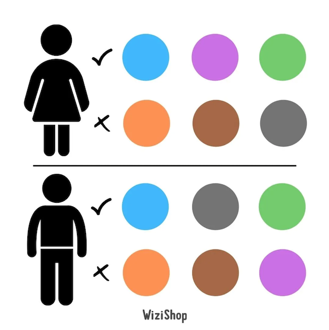
Studies on color psychology have also shown us that certain colors are to be avoided or favored depending on the target:
- Blue is more popular with men than with women.
- Brown is not appreciated by men and women; brown is not well seen by consumers.
- Purple will speak more to women than to men.
What’s more, after having found your identity, your entire graphic charter and branding will have to be linked to your main color with complementary or, in contrast, differentiating colors in order to emphasize the important elements or the urgency of an offer, for example, on a CTA button.
The purchase intention is also impacted: depending on the way the consumer perceives the brand, they’ll then turn to it or not based on their needs and especially the relationship they have with it.
A feeling, a mood, a message, etc. Your color determines many factors that will be as many conversion levers if your marketing strategy is successful. Your activity, your product, your choice of services will be carried by the colors of your identity. You’ll also be able to differentiate yourself from your competitors’ sites and become a benchmark on the internet.
But be careful: the most important thing is to follow your instinct and create harmony between all your colored modules to create magic, your magic!
The meaning of blue
The color blue is considered the most popular color in the world. Although it may evoke a sense of sadness for some, it’s still one of the most popular colors because of the number of shades that correspond to many different messages.
Most of the time, it’s these different characteristics that define blue:
- Calm: evoking the natural elements, such as water and sky, elements that are themselves attached to freedom, lightness, and dreaming.
- Confidence: over time, companies that have used blue all share a benevolent and positive image (health, well-being, solutions, etc.).
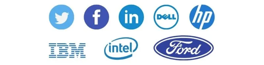
- Communication: social networks like Twitter and Facebook have made blue their color, and this goes far beyond their logo, even on navigation pages.
- Security: in terms of cybersecurity, automotive, transportation, blue is shared by many logos.
- Future: the majority of technologies and advanced software use blue.
- Universality: blue is neutral and appreciated by all according to studies. It is inclusive.
Thus, several sectors of activity are affected by blue:
- Health and well-being (examples: Laboratoire Boiron, Pfizer)
- Transport (Amtrak, KLM Group)
- New technologies (Twitter, Facebook)
- Financial services (American Express, Allianz)
- Automobile manufacturing (Ford, GM)
The meaning of green
Green is first and foremost linked to nature and the environment. Over time, companies that have taken a “green” and eco-friendly turn have added green in their communication content.
It’s also the color of various ecological labels around the world.
In parallel, brands have appropriated this color to convey other values, wealth or success. Other consonances are added:
- Energy and progress: companies linked to success, training, and learning use green for their branding.
- Growth: in many parts of the world, green stands for hope and luck, like the four-leaf clover, for example. Thus, green can be considered a good luck charm.
Several sectors use green:
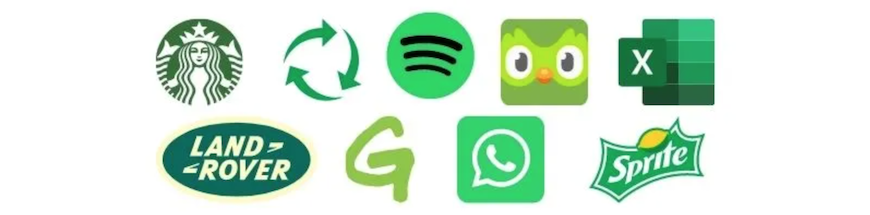
- Ecology and environment (Greenpeace, ecological labels)
- Health and wellness “natural” (Yves Rocher, Garnier)
- Technology (Whatsapp, Spotify)
- Young institutions (Sprite, Starbucks)
Note: green is an ambivalent color because, depending on the tone chosen, the message will be more or less aggressive. Furthermore, green is a color that brings bad luck to the theater according to the legend. It’s therefore best to handle this color with delicacy…
The meaning of yellow

Yellow is directly related to light and the sun. Bright and positive, it’s one of the most common colors because it attracts attention. Although, at first glance, it represents a feeling of joy, it can also be synonymous with jealousy, even deception.
The feelings associated with yellow are not only positive and can give a double meaning to your brand image.
- Energy: yellow is bold and noticeable, as long as it’s highlighted by a contrasting color. It’s often paired with blue or black.
- Youth: signs using yellow are often associated with a young target and youth-related brands.
- Betrayal: be careful with the use of yellow which, despite everything, remains a connoted color (deception, betrayal).
Some areas often affected by the color yellow include the following:
- Food (Pringles, McDonald’s)
- New technologies (Snapchat, Bitcoin)
- Transport institutions (Midas, Hertz)
- “Low-price” brands (Ikea, Lidl)
Yellow is an excellent color for a young company with a modest target and a practical product. Yellow is not the best color for luxury or high-end products.
The meaning of orange
The color orange draws attention and connects the brand to a notion of creativity, openness, and progress. It’s a joyful and inclusive color. It also allows brands to stand out from the competition.
- The future: it corresponds to a feeling of confidence and openness to tomorrow. Large companies have adopted this color, which makes it a corporate “reference” color.
- Dynamism: by being associated with the name of the fruit filled with vitamins, the message is clear regarding the services offered by your company. Speed, confidence and security define the companies linked to this color.
More and more luxury brands or those wishing to communicate around a new premium image use orange.
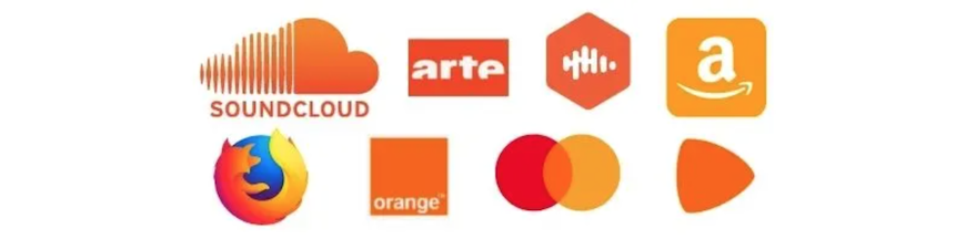
The areas of orange include the following:
- New specialized technologies (SoundCloud, Firefox)
- Services (Mastercard, Orange)
- New sales services (Zalando, Vestiaire Collective, Amazon)
Orange encourages purchasing and consumption. Moreover, this positive color gives confidence to consumers.
The meaning of red

Red is obviously linked to passion, love, and sensuality in the collective imagination. It’s also a synonym of risks, of danger.
- Love, passion: the heart, the red rose, sensuality ... all these concepts are linked to red, a sentimental attachment to a universal color, which directly affects the emotions.
- Life: in the food industry, red is synonymous with life and energy. It also offers an image of speed, rapidity, and confidence.
- Danger: red is associated with images of emergency (firemen, road signs) and danger because it’s also the color of the forbidden. Red is then a symbol of boldness and courage. It makes it possible to highlight the brand and the product as an object for people to have without delay.
These are some of the sectors affected by red:
- Food, agribusiness (Coca Cola, Five Guys)
- Entertainment (Netflix, YouTube)
- Causes and associations (Sidaction, Red Cross)
- Fashion (Levi’s, Uniqlo, H&M)
Red is also a color of refinement. It evokes intense emotions, ideal for CTAs!
The meaning of pink
In the collective imagination, pink is associated with childhood, femininity, and romance. Until the 21st century, marketing strategies necessarily linked pink to girls and women.
Through the evolution of society, the colors related to gender have faded away in favor of universal messages.
Pink has multiple nuances:
- Softness and benevolence: tenderness is related to pale pink. Sweet treats are also related to pink, which makes many people return to childhood. Softness emerges from this color.
- Originality: brands wishing to break away from pre-established rules and invest in the field of boldness and originality will choose pink to assert a universal, differentiating message. If the pink is flashy, the brand certainly desires to be noticed.
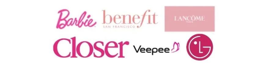
The sectors related to pink are the following:
- Clothing, fashion (Eden Park, Etam)
- Beauty (Lancôme, Benefit)
- Technology (LG, Veepee)
- Childhood (Barbie)
- Adult content (Closer, Marc Dorcel)
Creativity and softness take hold of this color that breaks the rules. Bright, punchy, it gives energy to your brand that’s going to stand out for sure!
The meaning of purple
On the internet, purple has become a reference for logos. The web is full of new technologies whose graphic charter uses this intense and elegant color. The effect is maximum with purple: it inspires security and mystery.
- Luxury: purple is also associated with dreams and mystery, two elements dear to the heart of the luxury sector. Purple is linked to style and refinement as well.
- The spiritual world: dark purple can be related to the galaxy and the stars and therefore to the esoteric world, always in the field of mystery.
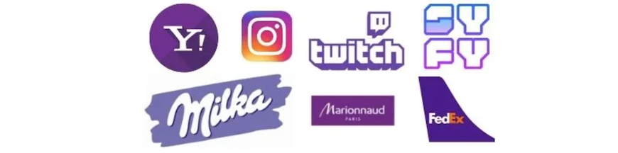
Some fields using purple as a base color are the following:
- Luxury and beauty (Marionnaud, Molinard)
- Food (Milka, Cadbury)
- High-end technology (Instagram, Twitch)
Purple would be perfect to associate with high-end products or intended for a premium target. It contrasts perfectly with yellow or orange to bring out all its power.
The meaning of black
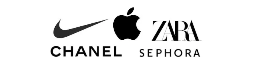
This absence of color is neutral. Black is nevertheless synonymous with elegance, refinement, and quality.
Even if it’s the last shade of dark, its sobriety and neutrality make it a reference in the marketing world for any company wishing to convey a controlled, sophisticated image.
- Eternity: black allows any company to maintain its graphic charter through the years and decades. Thus, black is synonymous with longevity, specific to the great houses of luxury, which allows this color to benefit from an aura of success thanks to the big brands.
- Sadness: black shouldn’t sink into darkness. This color is to be used sparingly so as not to provide a negative impression.
Black should be reserved for very specific elements. Black shouldn’t be used in the background, on photos, or in videos, as it could make the message unreadable or too difficult to understand.
All sectors are concerned by black, which makes it an ideal color for your brand and your logo, leaving you the possibility of modifying your graphic charter for certain events, for example, and adding other colors in an ephemeral manner.
The meaning of white
White symbolizes neutrality. In a design, or on the page of ecommerce sites, white allows the customer to see clearly in the navigation. The effect of white is to leave the choice to the communication agency or the professional to add any color on its medium.
White is universal and essential in any marketing and communication strategy.
- Purity: white leaves room for other colors and provides a sense of organization.
- Refinement: the brand is supported by an impression of elegance and prestige with the help of white. It enhances products and services when used as a background on a web page.
Color associations
To make your brand, your website, and your company shine on the web or on social networks, here are two last things to focus on to considerably improve your brand image.
- Neutral colors: brown, beige, cream, off-white... so many colors that will support more intense colors and create an elegant image. In the fashion, beauty and luxury sectors, neutrality is used to support all the products in ultra-creative catalogs.
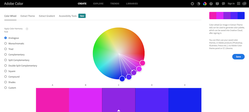
- Complementary colors: it’s not just a matter of choosing a classic complementary color (orange versus purple for example) but testing several combinations to find your ideal equation. To do this, go to the Adobe color wheel: simple, practical, and free!
Now that you know the basics of color psychology, what will your palette be? If this problem is still difficult to solve, you can always turn to a professional graphic or web designer: these experts will be able to translate your brand and your expectations, tailor-made!
At WiziShop, all our designs adapt to your colors: host your logo and become the hosts of your graphic charter through time. Your ecommerce store is just waiting for your branding and personality to shine through your chosen colors!
Try WiziShop free for 7 days
THE EASIEST NO-CODE ECOMMERCE SOLUTION✅ No credit card required
✅ Access to all features
✅ No commitment