
The website footer is often neglected by e-tailers. And yet, it’s an essential element of your online store. Its importance is considerable. Of course, it may not be the most visited section of your site, but the footer remains a section that users view to get more information about your site, your brand, your products, your services...
Today, you’ll learn all about website footer optimization and how to quickly direct your visitors to relevant pages and of course, develop your sales.
What is a website footer?
A website footer is a section located at the bottom of a webpage. It typically contains important information like contact details, privacy policy, terms of service, site navigation links, social media icons, and sometimes a brief about the company or organization.
The footer is a consistent element across all pages of a website, providing a convenient location for visitors to find essential information and navigate the site more effectively—a crucial part of your ecommerce checklist. It often complements the main navigation and can enhance user experience by offering additional resources and links.
Why is the presence of a footer mandatory on a website?
Let's start by understanding the importance of having a footer on your online store. Any self-respecting website requires organization in its information management. Thus, you cannot consider your main menu as a "catch-all." Beyond the fact that it’s not recommended, it’s quite simply not allowed!
Note that the more your visitors are confronted with alternatives, the longer it’ll take for them to decide whether to click on a particular place or to leave your site... In fact, it’s preferable to limit the organization of your menu to your product catalog only.
So what should you do with the other information that’s secondary but just as useful for the visitor? This is where the footer comes in! Its purpose is to support visitors in their research and expectations.
The footer remains completely flexible, which allows it to meet the objectives and needs of different companies. You decide which elements you want to highlight and which you think will be beneficial for your users. The footer should provide a satisfying user experience by presenting useful information that will, at the same time, increase the performance of the ecommerce website.
Links in footers can be very useful, especially on long pages and for mobile users. Long pages require the user to scroll down, which takes the main menu away, especially if you don’t provide a floating menu or a shortcut that goes up the page. So, instead of forcing the user to scroll all the way to the top, the footer at the bottom of the page can allow them to access the main links more quickly.
Another function of your website footer is to convince a new user of the authenticity of your site, the professionalism of your brand, and the quality of your products and services.
What links should you put in your website footer?
In practice, there are three categories of links that can be found in footers.
Indispensable links in the footer
The elements that I’ll list in this category are essential to present a successful footer. Generally, these are the basic headings that aim to strengthen the trust of users on your site and the services you offer. It’s about supplying the answers to the most frequent questions they may have.
Services
The description of your services must be integrated into the design of any footer of an ecommerce shop. These sections must meet the needs of your visitors who are still hesitating to make a purchase on your site. You can then convince them via these links that you add to your footer. To define the sections to present, it’s advisable to observe the most popular sections of an FAQ page:
- Delivery: This link will, of course, refer the user to information about delivery times and costs. Remember that it’s essential to present this information as soon as possible so that the customer doesn’t have an unpleasant surprise at the time of ordering, which could lead them to abandon their order.
- Order tracking: For your customers, this shortcut can improve their purchasing experience. For your new visitors, it's an additional sign of confidence that’ll motivate them to order on your website.
- Your returns policy and payment methods: These two sections address the same issues as the one dedicated to delivery.
- The "Contact Us" section: Visitors must quickly find out how they can contact you in case of a problem. Highlighting this element in the footer and the presence of a phone number and/or a contact email clearly visible always helps to strengthen the trust given to your business.
- A guide (sizes, evaluations, tools,...): If a guide is necessary to shop with peace of mind on your online store, it should be highlighted in your footer.
- The FAQs: A link to your FAQ page should be in the footer so that visitors can quickly find all the answers to their questions.
Company information
This section concentrates all the links concerning your company. Here’s the information that’s usually found:
- "About": The essential "About" page can also build trust around your sign. It explains the nature of your business and the history of your company.
- Company values: This link is optional and should only be considered if you have a value (or values) that sets you apart from your competitors. If this is the case, communicating it will give you an advantage. For example, you can highlight the local factor of your products, the manufacturing process, the absence of GMOs, etc. These assets have the function of bringing an added value to your products.
- Geolocation of the points of sale: If your brand has several physical stores, some of your visitors may come to your site in order to find an address. They’re therefore not looking to buy online. A link allowing them to locate your stores will be highly appreciated and will improve the buying process of these visitors.
- Copyright: The mention of this simple line allows you to protect your website and its content.
- Legal notice: This information must be included on your site. It mentions the privacy policy, the general sales conditions, etc.
- Sitemap: It has a double objective:
- For your visitors: to offer them a complementary and accessible navigation on all the pages of your site.
- For you: to facilitate the exploration of your pages by search engine robots.
The copyright, the legal notice, and the sitemap must conclude your page and be relatively discrete. A little design tip: the contrast and height of a footer can hide these items on the page. This way, they don’t compete with the more important navigation elements.
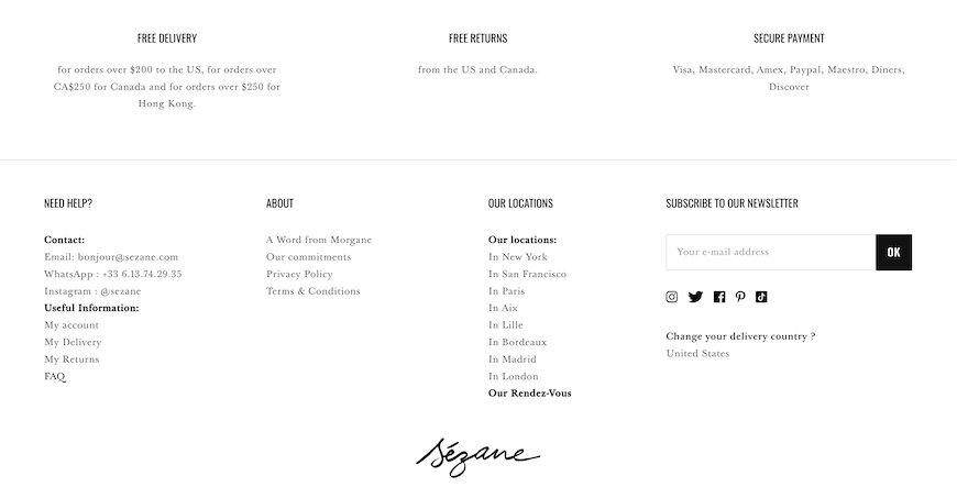
To illustrate these types of links, the Sezane website is an excellent example. We find the values of the brand, info regarding delivery and returns, FAQ page, contact details like email and phone number for customers to call or text, store locations, privacy policy, social media icons and more for a better shopping experience in the footer of their site.
Examples of recommended links
Let's now talk about the different types of content that bring real added value to your website. They improve the fluidity of the site as well as the purchasing funnel.
Catalog categories
By offering a secondary form of navigation to access the catalog, you prevent visitors who reach the footer from having to scroll all the way to the top to find the main menu on your homepage. This little ergonomic trick can be presented in two ways:
- with a light version that consists of presenting only the most popular sections and
- by offering a mirror of your menu, which can be very heavy depending on the size of your catalog.
Trusted logos
According to the study conducted by Idealo, trust logos are recommended for brands that need to reinforce their reputation and the added value of their website. These trust marks presented in the website footer can have an impact on the purchase decision. For example, if your business offers the PayPal payment method while your main competitor does not, highlight it to attract regular users of this service. Two forms of trust logos are to be prioritized in your footer design:
- Security certificates: They allow you to prevent the security of your site (presence of malicious links, usurpation of personal data, security of payment data with trusted third parties, etc.).
- Payment logos: They display the accepted payment methods (Visa, Mastercard, PayPal, etc.).
Loyalty
Of course, your footer is an ideal section to encourage your visitors to follow you, both via subscription to your newsletter and on your social networks. Be careful, it’s always best to mention the advantages of subscribing to a newsletter.
"Don't miss any news" and "Receive our special offers" are classics, but remember that offering a coupon code for any subscription is a plus to attract the user's attention. The signup should also be able to be done as quickly as possible, in just a few clicks.
In terms of your social media, add clear, easy-to-understand text or buttons that link to your business’s accounts on the various networks. Be sure to test the links to verify that they work and direct visitors to your social media pages.
Modular links
This last category of links depend on the digital marketing strategy of the specific brand. They won’t all be relevant to your business. They depend, among other things, on your objectives, the scope of your catalog, and the desired influence.
Information related to a local business
This information is, of course, relevant for stores that have a physical location and whose clientele is rather local. The indication of these elements in the footer will also help your local SEO. In addition to the name of your store, you can also indicate the address of your store, its phone number, and possibly, for a better shopping experience, the opening hours.
For international brands or those that only sell on the web, the customer service number should be clearly visible, if it hasn’t already been done above.
The search bar
Avoid forcing your customers to look for the search bar! If it’s not present in the website header, it must be in the footer. This will give you two main advantages:
- Your users will have an alternative to search for a specific product.
- You’ll be able to identify the most typed queries. In this way, you’ll be able to define which are the most popular products (and feed your stock according to them), and you’ll know which keywords to rank for to optimize your SEO and drive ecommerce organic traffic.
Customer reviews
Of course, this element makes it possible to reinforce the trust of the users towards your online store. When we know the importance given to customer reviews, we can only confirm that this feature is essential.
Guarantees
If you offer guarantees and optimal customer service, remember to communicate them with a banner that you can separate from the rest of the website footer. This will allow them to have a stronger impact.
Gift cards
Similarly, if you offer gift cards, the footer is an ideal place to inform your visitors. It’s sometimes difficult for a gift card recipient to get information on how the card works and what the benefits are. A link in the footer would allow them to find the answers to their questions.
Product catalog
As for the guarantees and gift cards, if you offer a paper or virtual catalog, you can bet on a miniature. This way, users will easily find it.
Blog
If writing blog posts is part of your business’s marketing strategy, don’t forget to add a link to your blog in this bottom section.
Mobile application
If your store has a mobile application, the footer is the perfect place to highlight this specificity, especially with a call-to-action button to redirect the user to the app’s download page.
Careers
This practice is quite common. If you offer a job section, you can give it visibility to help your future candidates contact you easily. A "Join Us" link is regularly found.
Affiliates
This last element is different from the others in the sense that it’s not an element that promotes the conversion of your users into customers. Instead, it aims to help your online store grow by building a network of affiliates. A link in the footer can therefore help develop new business opportunities.
Of course, the above list isn’t exhaustive and depends on your industry, your services, and your strategy.
What are the best practices for organizing your footer menu?
Now that you know which links you can include in your footer, it’s time to make a selection and structure it. Here are four very relevant steps for website footer optimization to know when you perform an ecommerce audit.
Define the elements to be integrated
As with your main menu, the footer shouldn’t be overloaded. What makes it different, however, is that it can contain a wide variety of information. It’s therefore important to select the links that should be permanently highlighted. To help you, you can use a grid design with three columns and evaluate the different elements mentioned above:
- In column 1: Note the interest you have in promoting the discovery of the page in question to influence your sales.
- In column 2: Note the interest in promoting engagement and conversions.
- In column 3: Weight these scores.
Offer quick and simple navigation
Once your selection is made, you need to organize the information to make it easier to read. You should therefore group your different elements into four to six categories.
To limit the number of categories, they must be sufficiently broad and explicit. For example, the "Customer Service" category might include subsections on delivery, returns, payment, terms, and conditions, etc.
The wording of each element must also be optimized so that they’re short and clear. Finally, order them by degree of importance in each category.
Contact, payment, reassurance: arrange the information
Depending on the size of your catalog and the number of your services, it’s possible that your footer is imposing and that it’s difficult to integrate all this information without disturbing the visual. Keep in mind that the objective is to be "user friendly" and therefore to facilitate reading.
For this, you can, for example, use several subdivisions of your footer that’ll allow you to best highlight your different kinds of information.
Keep a clean design and a minimalist inspiration
Your footer must remain simple and readable. It’s best to not overload it with superfluous graphic elements, and you’ll probably have to make a choice between promoting the newsletter, gift cards, a catalog, or trusted brands. A plain background is highly recommended, and it should always stand out from the rest of your pages. In this way, the user will be able to identify the contrast and therefore, your footer, at a glance.
Finally, the size of the footer depends on the amount of information and the number of pages contained on your online store.
Test and optimize your website footer!
You now have all the elements in hand to design an optimized website footer, both for the performance of your store and to improve the UX of your site. However, as always, we advise you to regularly analyze whether the links included in your footer correspond to your visitors' expectations: a good ecommerce audit is a guarantee of longevity!
To do this, consider performing A/B tests to study the performance and create a footer that is optimized to the maximum. With the WiziShop solution, configure your ecommerce footer in a few clicks in your administration area.
Try WiziShop free for 7 days
THE EASIEST NO-CODE ECOMMERCE SOLUTION✅ No credit card required
✅ Access to all features
✅ No commitment