The first impression you get when visiting an apartment will often allow you to have a general idea of what the entire property is like. It’s the same thing for a website: as soon as you arrive on a website, the first visible and displayed elements will allow you to judge the appearance, the seriousness, and the interest of the brand in relation to the research of the reader or the consumer.
The header of a website is essential and one of the most important elements in the design of a website. It contains all the central information related to the company or brand that the site is designed to showcase.
If you thought that the header of your website was only aesthetic, you’re mistaken! But don't worry, we’ll explain all the secrets of a good header to help you take advantage of this prime location and turn all your visitors into qualified leads!
What is a website header?
Definition of the header
The definition is simple: the header is the top of the page on a website present on your homepage, a landing page, a blog post, and on most of your pages. This location will allow users or consumers to quickly find the information they need at a glance but also to invite them to stay on the website with a graphic charter and reassurance icons.
The header of a website is therefore central in the design of its platform: it hosts all the essential information and obvious shortcuts, which will boost your brand image while increasing your chances of reaching your goals on the web.
Why is the header an important part of a website?
The header will welcome all your visitors. As an essential part of your website, it’s the first impression that the visitor will have of your brand. It can’t be neglected.
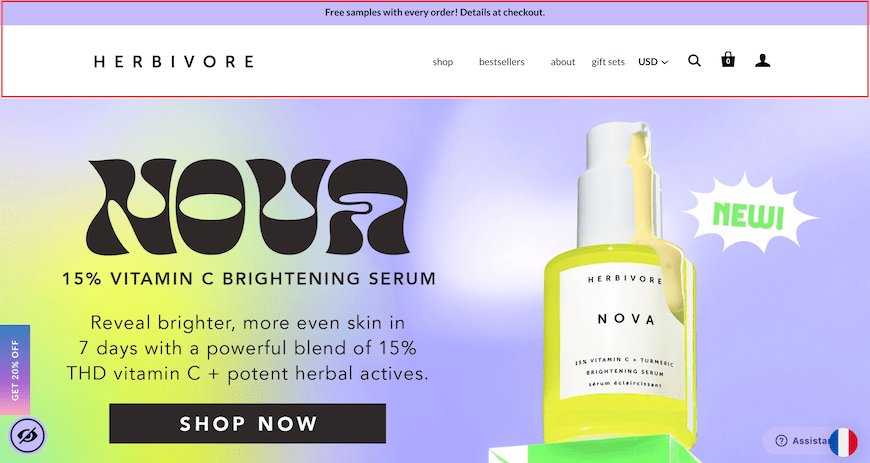
Example of a header on the Herbivore Botanicals website
In addition, it contains important information to allow users to navigate within your pages. Menu, internal search bar, access to the shopping cart, etc. A good header is about prioritizing the user experience in order to increase your conversion rate, to convert your visitors into buyers.
What are the advantages of a successful ecommerce header?
A successful header is a top of the page that will combine several qualities to help navigation on your website. Adding important information in the header when you build your ecommerce website from scratch will save time and energy around your visitors’ questions: if your header is well organized, users won’t have to ask you to find the answers to their questions.
When this part of the site is successful, it’ll reduce friction, especially in the sales funnel for your buyers: in a few clicks, the buyer will be able to access their account area, their shopping cart, or the categories of your catalog, without having to search for each location. And when you know that an extra second of waiting in the navigation is about 7% of conversion loss on ecommerce sites, then you understand that a good header is priceless and can help you to maximize how much you can make in ecommerce!
A successful header also means giving your website a quality brand image: by adding exceptional offers; by adding modules to your menu to highlight your new products or your discounts; by highlighting the blog part of your site; by configuring your logo to be the right size, the right format, but also to have an attractive color background; etc. All these elements, as much aesthetic as practical, well configured, will allow your website to shine in the eyes of your prospective customers.
How to create good headers: the 5 essential elements
Give an image to your brand with an original logo
As you manage your ecommerce site, note that the logo is an element of design content that will help define your brand, its originality and authenticity through an icon that looks like you. You can create it yourself easily with solutions like Canva or call a graphic designer.
Visually, the logo will allow your website visitors to almost unconsciously recognize your site or to get an idea of your offers just by looking at the design of your ecommerce site. Displaying your logo on your header is almost an aesthetic obligation on websites.
Some site owners do not hesitate to add a slogan below their logo to accompany their design with a tagline that resembles them. The choice is yours: your header is unique, as is your brand and your logo.
You can also add links to your social networks to encourage users to become part of your community.
Create a readable menu for efficient navigation
The menu will allow the visitor to navigate on your site in a few clicks. It’s important to optimize the categories you create to avoid any friction on the site visitor’s side.
On ecommerce sites, recommendations turn to the types of so-called “hamburger” menus: internet users know that to access all the tabs of your menu, they must click on an icon or on a first menu level that will allow them to discover the subcategories, for example “Clothing > Jackets and coats > Blazer.” In this example, the word “Clothing,” once clicked, will reveal the other categories below.
This type of menu allows you to save space in the header so as not to overload this part of the site and to offer the best experience possible for people visiting your online store. Your header menu will also have an SEO impact on your website.
Also, the chosen font and colors will be important decisions in order to make the reading of your menu as easy and accessible as possible. When it comes to website headers, think user experience!
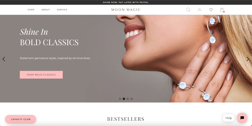
Example of the Moon Magic store, whose menu allows you to preview the categories in a very visual way
Include a direct link to the shopper’s account
In ecommerce, two places must appear in your header: the direct access to the member’s space and the shopping cart.
These two small icons are often placed in the right corner of ecommerce headers. With a single click, the customer must be able to see their shopping cart and access their information saved on your website so that the sales funnel is as fluid as possible.
To reassure the customer during their navigation, it’s best to have the shopping cart display a small bubble with the number of items in the cart, which changes based on the visitor’s actions.
Some sites transform the “customer account” icon into a small sentence like “Hello [First name]” once the shopper is logged in. Personalization will score you points in your online retail business.
Add an intuitive search bar
The internal search engine will allow customers to type in keywords to directly find the reference they are looking for in your catalog without having to navigate through your pages.
The current ecommerce trend is predictive shopping: having this type of tool can only help speed up navigation on your ecommerce site and thus boost your conversion rate.
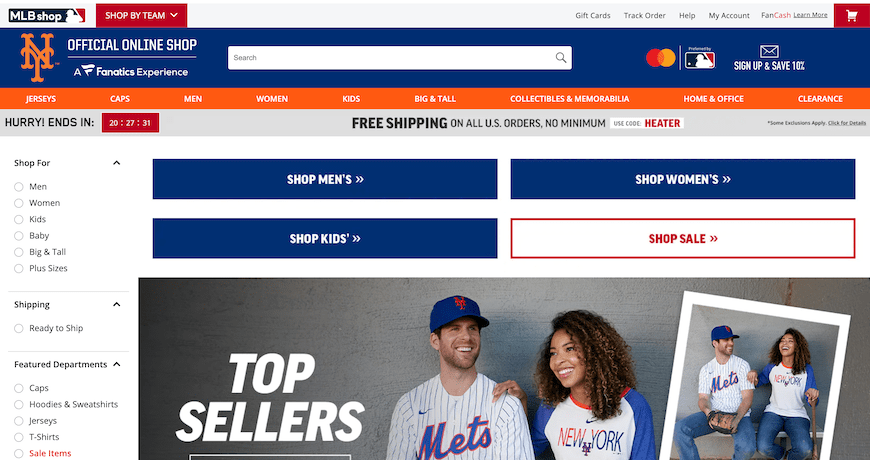
On the official New York Mets store, the search bar is very visible, as well as the different categories of the site, for optimal navigation.
Set up a notification bar, a central marketing lever
The notification or announcement bar will be installed at the very top of your homepage to promote an exceptional offer, a special event, a unique promo code, etc. It stands out from the rest of your design thanks to a bold color and a rather imposing writing style.
It allows you to offer your visitor an unmissable opportunity to convert him into a qualified lead. Subscribe to a newsletter, invite them to use a coupon code, participate in a contest... Configure this emergency bar to your image to encourage users to stay on your site but also to build customer loyalty.
At WiziShop, you can configure your emergency bar at any time in a few clicks from your administration area. We know how effective this option is as a marketing lever: that’s why it has a special place in our ecommerce solution.
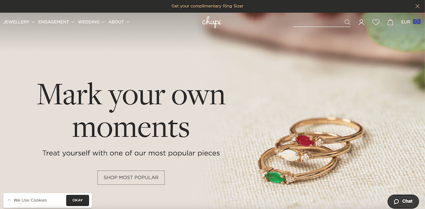
Example on the Chupi Jewellery store, with a notification bar inviting customers to get a complimentary ring sizer
Try WiziShop free for 7 days
THE EASIEST NO-CODE ECOMMERCE SOLUTION✅ No credit card required
✅ Access to all features
✅ No commitment
What are the mistakes to avoid making on the header?
Adding too much information
Although the header is the most important part of your website, don’t drown your visitor in a sea of information!
Pay attention to the size of your text and make it as readable as possible: use it for the user experience, not as a blog or a social network.
Not updating your information
Be careful: when an offer on your emergency bar, for example, expires, don’t forget to modify or delete that particular text.
For example, when you offer a Valentine’s Day promo code, remember to remove it right after February 14, and don’t wait until Mother’s Day to update it.
Not checking the appearance of your header on the mobile version of your site
Mobile is becoming the preferred channel for web users and consumers worldwide. When configuring your header, always preview your creation on your mobile version either directly in the preview of your administration area or by connecting directly from your mobile to your website after saving your changes.
If you find that your online store is not selling very well, a heading that looks sloppy or unprofessional on your mobile site could be a contributing factor. A responsive ecommerce site is priceless!
FAQ: recurring questions about the header of a website
What is the top of a website called?
The top of a website or website header is more commonly known as the header in jargon.
Where is the header on my website?
As the name indicates, the header is located at the very top of your website, regardless of the page consulted.
What is the difference between a header and a footer?
The header refers to the top of the page, while the footer represents the foot of the page.
Now that you know all the secrets of this section of websites and ecommerce, it’s now up to you to install a model that works for your brand and is also effective. The content, the graphic charter, the highlighting of a collection or your product catalog, the presence of links to your social networks, etc. Make your header the marketing showcase of your website or your online store to leave a memorable souvenir to all your future customers.


