Today, to optimize their online store, digital marketers and ecommerce managers spend a lot of energy on strategies to generate visits.
But getting more and more visitors to your pages is expensive in terms of time and money. That's why it's important to ask yourself how you can optimize this hard-earned traffic.
What percentage of your visitors leave your e-shop without converting? The answer is without a doubt: too many!
Exit-intent technology could be the final building block in your conversion optimization strategy. Exit intent, and more generally, all real-time interaction techniques with your visitors, is a marketing idea that’ll assist you with meeting the challenge.
This technology offers you one last chance to convince your visitors by creating a personalized interaction in real time via a message that’s going to pop up on the user’s screen. No matter what your conversion goals are (increasing your overall sales volume, growing your mailing list, expanding your community on social networks, etc.), a well-thought-out use of exit intent will make your job easier!
In this article, we explain what exit-intent popups are, discuss the advantages of using them on your website, and provide you with some exit-intent popup examples and hacks to inspire and guide you in your future pop-up strategy!
What's exit-intent popup? How does it work and how do you trigger one?
First of all, what are we talking about with the exit-intent popup? To better understand the principle, let's approach the solution from a technical point of view.
Very simply, the exit intent consists of broadcasting the right marketing message to your visitors who are about to leave your site without having taken the expected action. Email capture, promotional offers, gamification... Many possibilities are available to users in order to boost your business.
The goal: to offer you a final opportunity to convince users, to craft an effective landing page, or simply to boost your pages.
Such tools are based on the use of an online platform (SaaS) linked to your website through the integration of two scripts:
- a mouse tracking code that’s implemented on all the pages of your website (ability to use tools like Google Tag Manager) and
- a code that analyzes the conversions generated by your exit intent, to be placed on the specific URLs where the message is broadcast.
This process, a bit tedious for the uninitiated (but very simple for any developer), rarely applies to sites that use ecommerce platforms. Many companies specialized in this technology have developed their own plugins and extensions, making it much easier for you to focus on other aspects of your business.
For each new page or URL visited by the user, their mouse movements are tracked and analyzed.
Mouse-tracking algorithms consider parameters such as the speed of movement and the direction of the user's mouse.
The goal: to predict the precise moment when your visitor is about to exit your online store.
The most effective solutions for exit intent are those that process this data as quickly as possible and react to all attempts to leave a navigation page (move to the address bar, the “close” cross, the back button...).
The last step, as you’ve probably already understood, consists of broadcasting a personalized message in real time. This usually takes the form of a window (popup) overlaying your page and is placed at the end of the conversion funnel.
The content of your messaging is crucial and will determine the success or failure of your campaigns, to reduce your ecommerce bounce rate in particular.
In this area, exit-intent tools offer numerous parameterization possibilities that’ll help you personalize your campaigns as much as possible and create real interactions with your potential customers.
Are exit-intent popups effective?
Exit-intent popups can be effective in retaining visitors and converting them into customers. By detecting when a user is about to leave a website and displaying a targeted popup, businesses have the opportunity to re-engage visitors with special offers (e.g., free shipping or a free gift), discounts, or subscription prompts. However, their effectiveness depends on factors such as timing, relevance, and user experience.
When executed thoughtfully and offering value, exit-intent popups can reduce bounce rates and capture leads, but overuse or irrelevant content may lead to a negative user experience. It's crucial to strike a balance and tailor exit-intent popups to align with user preferences for optimal effectiveness.
What are exit-intent popup tools and plugins for?
Today's e-merchants have a diverse array of exit-intent popup tools and plugins at their disposal to facilitate popup creation and allow them to optimize this element to achieve their specific goals. From user-friendly interfaces to advanced analytics, these tools empower businesses to customize, track, and optimize their exit-intent strategies.
Powerful technology
These tools adapt to your targets, your strategy, and your creativity.
It’s essential to focus on the rapid transformation of your customer knowledge into tangible benefits, whether it be an increase in online sales or an improved ROI.
Data by itself does not bring you anything: it’s by using it strategically that you achieve results.
More speed and flexibility
You can set up large-scale marketing campaigns in just a few clicks, without any special technical skills.
You take over and manage the content of your campaigns independently. You’re able to adapt to the needs of the moment and automate the marketing processes.
The result is an image of a brand in motion that creates original and relevant interactions.
Personalized marketing in real time
To demonstrate the usefulness of exit-intent personalization, let's take a concrete case: an ecommerce site wants to increase its overall sales volume.
A "basic" example of marketing interaction would be to design a standard message that’s displayed to everyone after a few seconds of browsing. It could offer a coupon for an order to be placed that day, in order to motivate the undecided.
This message is only going to have a real impact on your undecided visitors, i.e., the small portion of your traffic already qualified and psychologically committed to a purchase intention.
The results will remain weak, and in addition, you risk cutting your margin unnecessarily by proposing a promotional offer to your already convinced audience, which would have made a purchase anyway.
Finally, as far as the rest of your audience is concerned, this little message may have very well annoyed them... "Ugh, another ad..."
What we can say is that such a strategy is certainly going to have some positive effects on your conversions and maybe even on your bounce rate, but we can do much better!
Some tools today allow you to trigger the display of personalized messages, adapted to each of your targets.
The more targeting possibilities you have, the more positive the impact on your conversion rates will be. The MaxTraffic platform, for example, has developed several behavioral or technical segmentation parameters that allow you to qualify your leads and therefore send them relevant messages:
- What is the source of the visits (paid search, organic search, social networks, ...)?
- What is the status of this visitor (first visit, second or more, customer)?
- What is the amount of their cart?
- How many pages did they browse?
- How long did they stay on this page?
- From which country are they visiting my site?
- etc.
How do you create an effective message to pop up for visitors?
An effective exit-intent popup should include compelling content that addresses the user's concerns or provides added value to encourage them to stay. For the best exit-intent popup, there are various types of content that you'll want to be sure to include.
Bold copy that best communicates your message
Remember that your site visitors are likely already halfway "out the door" so to speak when they see your popup appear, and they probably won't be willing to stick around very long to read a long block of text. You'll therefore need to convince these users as quickly as possible to stay on your website.
Craft compelling copy for your exit-intent popup by formulating a strong headline and ensuring a concise and easily digestible description. Think about how your popup can provide a solution or address a problem for the people visiting your website.
You might also consider the use of humor in your copy, if appropriate for your target audience, of course. Showing your sense of humor in a popup can help you better connect with customers and make your message stand out from the slew of other popups they view every day.
A clear, direct CTA
A well-crafted call to action (CTA) not only guides user behavior but also maximizes the chances of conversion, making it a pivotal element in turning departing visitors into engaged customers. When users read your CTA, they should immediately understand what action they're meant to take next.
Adding an irresistible CTA for your exit-intent popup can work wonders for enticing visitors to take a desired action, such as making a purchase or subscribing. Use action-oriented language, instill a sense of urgency, and clearly convey the benefit of clicking.
A relevant image
Finally, don't forget to incorporate a relevant image in your exit-intent popup that visually complements your message and resonates with your brand. Choose high-quality visuals that align with your content and evoke emotion or curiosity.
The right image reinforces your message, making it more memorable and engaging for visitors. It helps producej a visually appealing and cohesive experience, enhancing the overall effectiveness of your popup in capturing attention and encouraging user interaction.
The best time for exit-intent popups
The right time for exit-intent popups is strategically timed when a user exhibits signs of leaving, such as moving the cursor toward the browser's close button. Implementing the popup at this crucial moment maximizes its impact, giving you a chance to re-engage users before they exit.
However, it's essential to strike a balance; too early, and it might annoy visitors, too late, and they may have already left. Keep in mind that there's no universal best time when it comes to when to have your popup appear to people checking out your online store.
Testing and analyzing user behavior is a great way to help pinpoint the optimal timing for your business, ensuring your exit-intent popups effectively capture attention and encourage desired actions without disrupting the user experience.
Popup design examples based on specific objectives
The following examples are possible uses of the exit-intent popup, but the technology has no limits and adapts to the strategies of each user.
Objective 1: Use opt-in levers to collect email addresses and generate new leads
These are the most common uses of the exit-intent popup for the simple reason that any website (blog, ecommerce, booking...) wishes to widen the distribution of its content and offers.
We know that the ecommerce email remains a powerful tool to maintain customer relations, and obtaining an email address is often crucial to try to convert/link.
To convince your visitor to leave their email address, offer them something!
A discount code, relevant information, a premium benefit, a welcome gift... You can expect at least a 15% increase in the size of your email address list (low average).
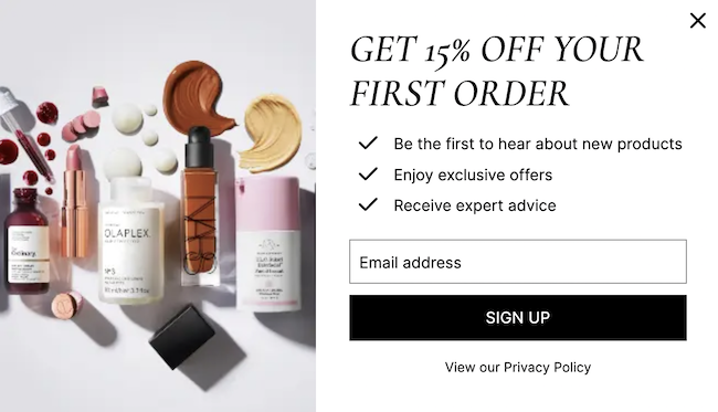
Source: Cult Beauty
Be careful though: in order not to bore users, think of configuring the capping and the frequency of your messages. You can target your new visitors as a priority and set up another message for your visitors who’ve already made a purchase or consulted your website.
Objective 2: Reduce cart abandonment with a personalized notification
In addition to abandoned cart email examples, popups can be employed to help reduce your abandonment rate. Cart abandonment notifications are very useful if you’ve analyzed the possible causes of why people are abandoning their carts beforehand. The results of popups are going to be all the more convincing if your buyer journey is optimized. Here are some examples of notifications.
- Free shipping According to LK Conseils, 46% of abandoned carts are due to high shipping costs. It’s possible to reduce this impact by broadcasting a targeted message to your "high-potential" visitors. Think about targeting only your visitors with a cart higher than the average figure or higher than a defined amount. This will preserve your margins while rewarding your loyal customers. If you identify that a loyal customer (therefore satisfied) abandons their cart, then they’re perhaps in a phase of tracking or waiting for a better offer. Valuing their loyalty by offering them free shipping is a great method to help you sway them.
- A welcome coupon: To convert new prospects, a proven technique is the welcome offer. You can consider launching a couponing campaign for every first order, with a discount code or promotion. The percentage method works like a lever on the amount of the cart. The more purchases a visitor makes, the greater the savings. Be careful about the quality of your welcome offer, as some visitors might be tempted to unsubscribe to re-register. For more efficiency, only broadcast this offer to your buyers who’ve already browsed several pages or who’ve already spent more than 15 seconds on your site. This way, you only start the dialogue with qualified visitors.
- Validate your cart today and receive a free item: Testing a new product is an interesting opportunity for your visitor. It helps to give a good image of the product and of your brand. These sampling campaigns only apply to certain types of products, but the idea can be used in other ways: a discount or a product bought for free, for example.
- A reassuring message: Sometimes a simple reminder can trigger conversion (reminder of your product return policy, secure payment, shipping tracking, etc.). It can also be reassuring statistics, customer reviews, an award received that attests to your quality of service, etc.
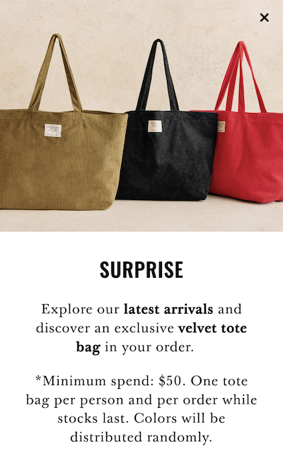
Source: Sezane
In a more general way, we can say that there are two levers that we can focus on:
- The notion of urgency by creating offers that are limited in time. This can give your visitor the idea that if they don't act right away, they risk losing out. This fear of losing an advantage, especially in terms of money savings, will encourage their decision making and action to buy. After all, nobody likes to leave money on the table!
- The feeling of exclusivity that’ll enhance the attachment to the brand and increase loyalty.
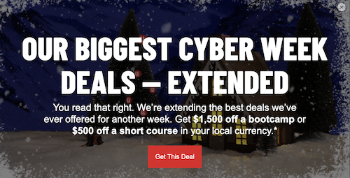
Source: General Assembly
It’s therefore possible to act on the shopping cart abandonment rate thanks to simple notifications at the exit of the website:
- The use of your visitor data allows you to personalize your offers and make them more relevant.
- Your promotional offers are only visible when they’re necessary to convert. Targeting allows you to propose premium offers only to your qualified targets and/or to visitors with a substantial shopping cart.
- You can integrate notions of urgency and exclusivity that’ll respectively act on the action and on the loyalty. It’s important to reassure and create a transparent relationship.
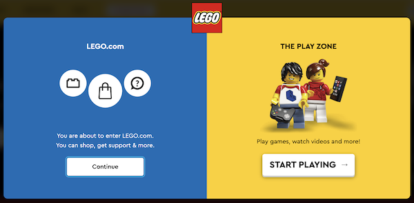
Objective 3: Drive your traffic to another page or site
The purpose of this use is to "influence your traffic." It’s likely that if your visitor spent several minutes on your website before finally leaving, it’s because they weren’t convinced or didn’t find what they were looking for.
It’s up to you to guide them to other content that you consider more relevant.
Redirect your visitor to your best-selling page or to another of your sites. You can also display a button towards your product search page or propose a search bar inside your message.
Source: LEGO
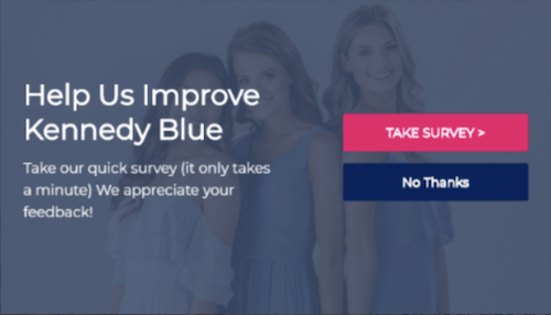
Objective 4: Gather feedback with a brief survey
You can also use popups as a great way to obtain valuable feedback for your business from people visiting your website. Feedback garnered through this method provides direct insights into user sentiments, pain points, and areas for improvement.
Craft concise questions addressing, for example, user experience, preferences, or reasons for leaving. Ensure that the brief survey is visually appealing and easily navigable.
Source: Kennedy Blue
In addition, set the popup to trigger at the right time, just before a user exits, capturing insights without disrupting their visit. You may want to also offer incentives like a discount code or exclusive content to encourage participation.
Implementing user suggestions enhances website functionality and content, ultimately improving customer satisfaction, reducing bounce rates, and optimizing the overall user experience, leading to increased engagement and potential conversions.
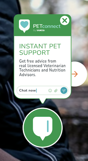
Objective 5: Encourage chatting
Encouraging people to chat via an exit-intent popup is a beneficial strategy for businesses seeking to address concerns, offer assistance, and retain potential customers.
Craft a compelling message highlighting the availability of instant support or exclusive assistance. Indicate the value of using your chatting feature, such as resolving queries or providing personalized recommendations.
To optimize this strategy, ensure your chat agents are readily available to respond promptly. You can alternatively add a chatbot to your online store to guarantee 24/7 assistance for your customers.
By offering immediate assistance, you not only enhance buyer satisfaction but also have the opportunity to salvage potential conversions, turning departing visitors into engaged customers through real-time engagement and problem resolution.
Source: Iams
Objective 6: Grow your community on social networks
Want to get more followers for your brand on social media? Don't hesitate to utilize popups to help you make it happen!
Requesting an email address can be challenging; in today's age of information overload, people are increasingly guarded about sharing this personal information. On the other hand, encouraging them to follow you on social media proves simpler, especially if your social channels already boast a substantial number of followers. Leveraging this kind of social proof, it shouldn't be too difficult to prompt a departing visitor to hit the "Like," "Follow," or "Subscribe" button.
In the copy of your popup, urge people to follow your social profiles for exclusive content, updates, and community interaction. Be sure to highlight the advantages of joining your online community.
Expanding your social media presence will aid you in amplifying brand visibility and create a platform for ongoing interaction, feedback, and relationship-building. Implementing this strategy not only strengthens your online community but also opens avenues for broader audience reach and word-of-mouth marketing.
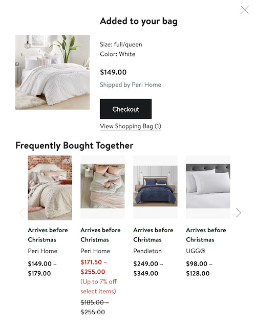
Objective 7: Cross-sell and upsell
Leveraging upselling and cross-selling through an exit-intent popup can significantly enhance business revenue and customer value. In the message that will pop up on your website, include persuasive copy showcasing complementary or upgraded products, enticing visitors to add more to their cart before leaving. Make it clear to viewers what value and benefits these additional offerings will bring to their lives.
To increase the likelihood of your popup's success, you might offer exclusive discounts or bundled deals. This is a great way to not only increase the average transaction value but also maximize customer satisfaction by providing them with relevant and valuable options!
By strategically presenting additional offerings, you can turn exiting visitors into engaged customers and drive incremental sales for your business.
Source: Nordstrom
Best practices for setting up a website exit-intent popup
Exit-intent popups offer lots of potential for captivating and converting the people visiting your website. To optimize your messages that pop up to your current and potential customers alike, there are numerous exit-intent popup hacks you can take advantage of. Here are some best practices to implement for your future popups.
Define your targets and the right message
In order to design effective exit-intent popup campaigns, it’s essential to define your targets and the objectives for each of them.
You can then (depending on the tool you choose) create your messages on this basis and launch your onsite actions for each profile simultaneously. For instance, while copy featuring humor may be beneficial for some popups you create, it may not be as effective for others.
Some tools offer online editors to create your messages, but it’s also possible to import your own creations.
Do A/B testing
With these types of tests, you’ll discover which title, which CTA button, or which color works best. For example, while red is generally the most effective color when it comes to capturing attention, you may find that the color pink works particularly well for your target audience or during certain times of the year.
You'll also be able to determine the right time to have your messages pop up for people on your website. With just a bit of effort, you'll run your tests, keeping only the best-performing one. Then, get ready to watch your conversions climb!
Mobile or desktop, adapt to the terminal
It's surprising to see that many sites are responsive, yet many popups are not.
You can simply configure these options, a campaign for each type of device, following the same principles as for your website for a responsive popup that works for people visiting your online store from desktops and mobile devices alike.
Check the loading speed of your messages
If your messages load too slowly, it’ll ruin your efforts.
To optimize loading, reduce the size of your images and design popups that use HTML or CSS. Of course, you must have worked on your online store’s speed beforehand for better load times.
In most cases, you’ll receive technical assistance in this area from your provider.
Use personalization
By delivering personalized content during the crucial moment of exit, you enhance the popup's effectiveness, making it a strategic tool for re-engagement and conversion on your website. To leverage personalization in your exit-intent popup, tailor the content based on user behavior and preferences.
Implement dynamic elements like the visitor's name, personalized product recommendations, or exclusive offers based on their browsing history. This creates a more engaging and relevant experience, increasing the chances of retaining the visitor.
The benefits of availing of personalization in your popups include improved user engagement, a higher likelihood of conversion, and a positive impact on brand perception.
Take advantage of consumers' selective attention
The human eye has a remarkable capacity to absorb vast visual information, surpassing the conscious processing ability of the brain. Consequently, the brain undergoes a rewiring process, concentrating on what it deems most crucial and overlooking the rest. This phenomenon, known as selective attention, enables people to naturally skim through less important details.
Leveraging this, you can strategically incorporate visually captivating elements that defy the brain's tendency to skim, ensuring your key content captures attention effectively:
- Striking images: Opt for impactful visuals to instantly engage your visitors; images are not only attractive but also convey information effectively, enhancing the impact of your campaign.
- Numbers: Incorporating numbers, particularly specific, odd numbers, piques curiosity and compels visitors to pause and pay attention.
- Graphical symbols: Enhance information comprehension by integrating graphical symbols in your text; arrows, in particular, guide the viewer's focus to essential elements, simplifying the cognitive process of filtering out less crucial information.
Add a progress bar
Adding a progress bar to your exit-intent popups can be very beneficial due to the Zeigarnik effect. The Zeigarnik effect is a psychological theory that describes the phenomenon where people experience a nagging urge to complete tasks once started.
The progress bar visually signals the incomplete status, creating a sense of cognitive tension, and encourages users to finish the process they initiated, such as entering information or accepting an offer.
Although a progress bar won't be applicable for every popup, it can be powerful exit-intent hack when used strategically. This subtle and effective technique that utilizes the Zeigarnik effect taps into the human inclination for closure, enhancing user engagement and increasing the likelihood of successful conversions by providing a clear and manageable path to completion.
Keep it simple
Your visitors who are about to exit your site are probably already very absorbed by your content.
They may not be in a good position to understand complex messages, or they simply don't want to make the effort anymore.
A few catchy words, a subtitle, a call to action, and a visual are often more effective than an exhaustive but overloaded message.
Final thoughts
Finally, I’d say that it’s often enough to test these technologies to see the benefits.
There are many tools on the market, of varying quality and price. Some tools are specialized in the support of large groups like Bounce Exchange, while others are adapted to the problems of smaller structures like MaxTraffic.
The analysis of the results on your dashboard will allow you to identify reliable indicators in order to judge the efficiency of your actions (number of displays, click rate, conversion rate after display, total revenue generated, etc.).
There's no doubt that real-time personalization has a great future ahead of it. The technique is going to continue to improve in order to help marketers transform their data into tangible results for their business.
In the dynamic landscape of ecommerce, exit-intent popups emerge as invaluable tools, bridging the gap between visitor departure and conversion. By strategically deploying these popups, businesses can build their email list, salvage potential leads, reduce cart abandonment, and foster customer engagement.
The ability to re-engage departing visitors at critical moments not only enhances user experience but also significantly impacts the bottom line. In the world of ecommerce, where every interaction matters, exit-intent popups prove to be a pivotal solution, transforming exits into opportunities and fortifying the seamless journey from browsing to conversion.
Embrace this powerful tool to not only retain customers but also elevate the overall success of your ecommerce endeavors!


