What could be more unpleasant than trying to connect to a website from a smartphone and not being able to? Maybe you've already experienced it... There are still websites that aren’t designed to automatically adapt to all screen sizes. This means that the websites in question are not responsive or, in other words, that they’re not mobile friendly.
Do you have a responsive theme, a mobile-first vision for your site, and a well-optimized mobile version? If these concepts seem unclear to you, read this article carefully and boost your chances of succeeding on the internet thanks to this specific format.
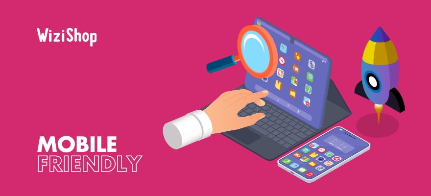
What is a “mobile-friendly" website?
Today, the desktop computer is no longer the most used way to access all information on the web. Users now prefer their mobile. In the age of globalization, everything has changed and desktop computers are now shunned in favor of other more practical, compact tools, whose designs are clearer in tools constantly available.
According to a study conducted by Eurostat, 56% of people use their mobile to connect to the web. In fact, maybe you’re reading this directly from your smartphone?
As you can see, the phone is absolutely everywhere. Mobile technology has become in a few years one of the most indispensable elements of our daily life. Therefore, as an e-merchant, you can't do without a mobile-friendly site. Your pages must be able to be displayed correctly, whatever the size of the screen used.
Definition of “mobile friendly”
"Mobile friendly" is an expression that was born in 2015. It refers to anything that automatically adapts to mobile usage.
Logically, a mobile-friendly website is a website optimized to be used smoothly and optimally on a cell phone.
This compatibility is now very important for search engines, and especially for Google, which doesn’t hesitate to highlight websites with an adapted display. This also refers to ecommerce responsive web design.
Key characteristics of this web format
When a website isn’t mobile friendly, it’s not enjoyable for visitors to consult it. They have to use their fingertips to zoom or to move up and down and from left to right, in order to read all its content.
Faced with these constraints, users tend not to stay very long on the site. The experience isn’t good, and many visitors quickly leave these pages to try to find equivalent content on another site, one that uses responsive design.
If you want your potential customers to stay with you, give them a better user experience!
Similarly, a mobile-friendly site must also offer a responsive display of pages. The visit must be fluid. Without this, you still risk losing many visitors along the way… In addition, the font used must be perfectly readable, including on smartphones or tablets. For this, it’s better to use a sans serif font, in a suitable size.
Finally, a mobile-friendly site must give access to all its content, that is to say not only to its texts... Images, infographics, and videos must also be optimized. Their format must not be cut off when viewed on mobile devices.
Advantages of making a mobile version of your website
Today, more and more websites are designed in a responsive way. Mobile-friendly sites offer a number of advantages. They improve the experience while boosting the SEO of the site and bringing a better conversion rate.
Mobile is becoming increasingly important in searches
Mobile browsing is a growing phenomenon. In 2021, mobile Internet traffic represented 55.56% of global internet traffic, which is more than half. Moreover, this figure is only increasing from year to year.
According to Médiamétrie data, 51% of the world's population uses a mobile device every day. If you don't want to miss out on a huge number of potential customers, you can't afford to skip a mobile-friendly site.
M-commerce: mobile purchases are popular
While many internet users browse the web from a mobile device to search for information, more and more are also using this tool to make purchases. According to Statista estimates, m-commerce sales were expected to reach $3.56 trillion in 2021. What's more, this figure is constantly growing. In just one year, it increased by 22.3% (m-commerce represented $2.91 billion in 2020).
SEO: responsive design to improve your ranking on Google
Did you know that mobile friendliness is a criterion that is taken into account in the SEO of a site? Since 55% of web traffic comes from mobile devices, Google makes sure to offer the best possible experience. The search engine therefore favors sites adapted to mobile use.
This interest in mobile devices is proven by the tools offered, such as the mobile optimization test.
The mobile search engine believes that websites must adapt to consumer behavior and expectations. In this context, because internet users expect a perfect experience on their mobile, Google makes sure to satisfy them.
Mobile friendly has therefore become a criterion in SEO, influencing the positioning of a site in search results.
A mobile-friendly site to optimize your brand image
Of course, having a mobile-friendly site also enhances your image with your consumers. It automatically makes your site more user friendly and enjoyable, while showing your users that you want to offer them the greatest experience possible.
To prove your seriousness, your site must absolutely be efficient and ergonomic. It must offer them a smooth and reliable experience. This is the first impression you give to your potential customers.
7 Tips to make your site mobile friendly
So, how can you offer your users a mobile-friendly site, without necessarily having a solid knowledge of Web development? Don't worry, WiziShop offers you all the necessary functionalities, in all simplicity!
Create a website with the best mobile-friendly solution
At WiziShop, we want to offer you an easy-to-use ecommerce solution with all the features that are essential for today's e-merchants. That's why we provide you with more than 400 different features, to allow you to create the most ergonomic ecommerce site possible.
Of course, mobile optimization is an integral part of our formula. All our ecommerce sites are designed to fit all screen sizes.
Activate the AMP format (Accelerated Mobile Pages)
You should also know that, when creating your ecommerce store with WiziShop, you’ll have the possibility to activate the AMP format. What is this? A very effective tool to improve and reduce the loading time of a page on a mobile device.
The network can vary considerably from one place to another. Not all users have a powerful connection to your website. This is why Google decided to implement a solution: AMP.
The standard of web page development, the AMP format was created in 2015. Google's ambition at the time was to significantly improve the user experience and the overall efficiency of browsing on mobile devices.
Google thus decided to find a way to lighten web pages on mobile. For this, the search engine uses a cache. All pages on mobile sites are retrieved and cached within Google's servers. It’s as if the search engine memorizes them, so that it can retrieve them much faster. This way, it avoids having to completely rediscover the content each time a user visits the pages of a mobile-friendly site.
With this process, Google has managed to make the code of the pages six times lighter to load. More concretely, the AMP system allows you to reduce the loading speed of mobile pages up to 85%! This is an important argument concerning the loading speed of an ecommerce site.
Of course, this time saving is free and generously offered by WiziShop! This format is available for all stores created on our platform, without any additional cost. The site creator simply has to activate this feature, which is already included in our basic pricing.
Try WiziShop free for 7 days
THE EASIEST NO-CODE ECOMMERCE SOLUTION✅ No credit card required
✅ Access to all features
✅ No commitment
Avoid pop-ups
Although we aim to make mobile browsing faster, it’s highly recommended to eliminate from your site all the elements that can make browsing more cumbersome. In this sense, I strongly advise you to avoid pop-ups!
These are generally not very appreciated on mobile devices and tend to degrade the user experience. They’re totally counterproductive and have the particularity to make visitors flee from pages that contain them.
Lighten the menus of your site
Similarly, for a better browsing experience, it's best to keep your site menus light and uncluttered. To make sure that all your pages are easily accessible from a mobile device, think about being reasonable about their number and setting up a menu that is easily adaptable to mobile devices from the start.
For optimal fluidity, remember that your visitors shouldn’t have to scroll when they consult the different pages in the menu of your online store.
Create readable and clear CTAs
If you want to prompt certain actions, also consider directing them with easily visible, accessible, and clickable buttons. Your CTAs must be clear and well placed. Without this, you may be missing out on a significant conversion rate!
Test for text and font sizes
Even though mobile-friendly sites are designed to be viewed on cell phones, they’re developed from desktop computers. It’s therefore essential to test your pages in real conditions before publishing them.
When you design your site, some texts may seem perfectly readable. However, the format and the shape of the fonts may not be suitable for loading on mobile devices.
Before any final publication, make sure that you’re fully satisfied with your work, including on a cell phone.
Lighten your email forms and images
Finally, always in the interest of fluidity, and in order not to weigh down your pages, try to shorten your contact forms as much as possible. Ideally, they should be visible in their entirety on the screen.
Also, pay attention to the format of your images. They should be neither cut off nor too heavy.
With a growing percentage of the population now equipped with a cell phone, companies are well aware of the importance of designing a mobile-friendly site. It’s become a powerful tool for making sales and contributing to customer loyalty. The statistics are clear, and ignoring mobile-friendly design is no longer possible for the success of your ecommerce business!


