We all know that marketing is very much linked to the psychology of the consumer and that certain elements can unconsciously influence their perception and their act of purchase. You'll find that the choice of colors is very important in all fields, especially in marketing. Sometimes, the psychological study can be quite extensive.
For ecommerce website content, in addition to the general design, the ergonomics, the words used, and the trust signals, the colors have an impact at multiple levels. To help users to remember your brand while provoking an emotion in the customer, you must choose your main colors along with complementary hues carefully, based on the chosen purpose and location.
Logo, call to action (CTA), banner, cart, footer... Your site must be presented in its best light while associating the right colors to the desired consumer behavior. Focus on these colors that’ll help your business!
What is color psychology?
Before we get into what colors make people want to buy, we first need to to take a look at the idea behind this: color psychology.
Color psychology is the study of how colors influence human behavior and emotions. Different colors can evoke different feelings and reactions; for example, red often signifies energy and urgency, while blue can induce calmness and trust.
This field intersects psychology, marketing, and design, providing valuable insights into how color choices can affect consumer perceptions and decisions. In marketing, color psychology is used to enhance brand identity, influence purchasing decisions, and improve user experience. For instance, choosing the right color scheme for a product or advertisement can significantly impact its attractiveness and effectiveness.
Understanding color psychology enables more informed and strategic design choices in various contexts, whether for branding, site content, social media, etc.
Top colors that can help you stand out and sell
Let's take a look at some of the most popular colors in marketing along with their uses.
Red
The color red is often associated with love, passion, urgency, danger, and power, and it can effectively trigger action in consumers. When used sparingly, red can significantly enhance sales, particularly for impulse purchases.
Arguably one of the most attention-grabbing colors, red is definitely going to catch the eye of people visiting your online store. Red can be great for inciting action on the part of a potential customer, especially when used alongside an page design with compelling copy.
On websites, red, particularly a bright red color, is most effective for "Buy Now" buttons or sales banners, as it can help create a sense of urgency and encourages quick decision-making.
Blue
For many people, the color blue brings to mind the ideas of trust, dependability, and calmness. It's important to keep in mind that the color blue can convey different things to consumers as well, depending on the particular shade. For instance, dark blue tends to indicate strength and reliability, while light blue often signals freshness, energy, and friendliness.
Blue can be very effective in boosting sales, though in a more indirect way than red. The color blue creates a sense of security and trustworthiness, especially important for industries like finance, technology, and healthcare.
When it comes to websites, blue is best used in design elements where you want to emphasize trust and security, such as login screens, information sections, and for companies focused on reliability and professionalism. It's less common in food-related brands due to the appetite-reducing effect it can have on people.
Green
The color green is associated with new beginnings, growth, and nature. It's calming and represents stability and prosperity. Green also serves as a signal telling shoppers to "Go ahead" with an action.
In terms of sales, green can increase conversions when used for action buttons like "Buy," "Order," or "Subscribe." The color green is generally most effective in designs related to finance, healthcare, technology, and nature-related products.
You'll find that green is one of the best colors to use wherever you want to emphasize growth, stability, or ecological aspects in your website content. This might include, for instance, CTAs, eco-friendly product sections, and payment-related services.
Yellow
See the color yellow, and you're likely to think of optimism, happiness, and youthfulness! Also symbolizing joy and radiance, yellow can help uplift spirits, spark enthusiasm, foster openness, and stimulate communication.
Yellow can be great for attracting attention and creating a sense of excitement or urgency. It's often used for clearance sales or in window displays in brick-and-mortar shops to draw in customers.
Yellow works well for CTA buttons on websites, especially for impulse buys or time-sensitive offers. If you sell children's products, consider incorporating softer shades of yellow. Using bright yellow in your branding can be advantageous if you wish to, for example, highlight a bold marketing move. In contrast, golden and darker yellows are frequently found on sites involving entertainment, leisure, and travel, as these hues signal stability.
Orange
The color orange is linked to energy, health, enthusiasm, vitality, and excitement. It's a playful color that can stimulate physical activity, competition, and confidence. Similar to red, orange is a bold color that can easily attract attention, but it does so in a manner that's less "in your face."
Organizations often use orange to build trust and encourage positive engagement, making it a popular choice for CTA buttons due to its attention-grabbing yet optimistic vibe. This vibrant color is especially effective in simple, clean website designs, where it stands out distinctly and prompts action, generally receiving a positive reaction from viewers.
Orange is an excellent choice for creating a warm, inviting atmosphere and is particularly effective in industries targeting a broad audience, such as children's and sports sectors. The color orange not only boosts feelings of confidence and energy but also stands out prominently against dark backgrounds, be they black, gray, brown, or another dark color, making it ideal for highlighting important features.
Purple
Purple, a blend of red and blue, embodies characteristics of both, representing nobility, luxury, and creativity. Historically linked to royalty, its shades range from light lavender, suggesting spring and romance, to dark purple, conveying elegance and mystery. Today, the color purple is a bold choice, free from the urgency of red or the solemnity of blue, often associated with spirituality and creativity, making it a unique choice for modern design and branding.
Purple is one of the top three colors preferred by women (according to a Kissmetrics study), which means that it may be an especially good option if your brand happens to target a female audience. It's versatile in web design, where dark shades suit backgrounds for a luxurious feel, and bright shades excel in CTAs and menu elements.
In addition, purple is often chosen by creative and high-end brands, particularly in the clothing and cosmetics sectors, for its association with prestige, helping people to feel a sense of exclusivity. Purple's striking contrast with yellow-green and compatibility with pinks and blues make it a distinctive choice against neutral backgrounds like white and black, often used for branding and conversion elements.
Black
Black, often seen as the strongest neutral color, is linked to power, elegance, and formality. It's versatile in design, lending itself to both conservative and innovative styles, and is particularly impactful when creating a sense of sophistication or mystery.
While not commonly the main color in many websites, which favor white and brighter colors, black is effectively used by luxury and high-end companies to convey exclusivity. Although black provides strong contrast, especially in black and white schemes, it's less effective for conversion elements. If you plan to use black in your advertising, note that it's likely to be more powerful when combined with secondary colors.
Black can be a great choice for your branding color palette, especially if your business involves luxury goods and services. In addition, if you're looking to follow the growing trend of minimalist design, incorporating pure black into your logo can further emphasize sophistication and elegance.
White
White, like black, pairs effectively with almost any color, symbolizing kindness, innocence, and purity. The classic black and white combination exudes elegance and simplicity. White can also have negative connotations, though, like sterility, emptiness, and indifference.
White is a key element in minimalist design, serving as a versatile background that enhances other colors and focal points. Referred to as negative space, white areas on a website provide "breathing room," improving readability and focusing attention on essential elements, while preventing visual clutter that can detract from the user experience.
White is ideal if you sell items involving nutrition and healthcare, as it evokes tranquility and peace, but it's less effective when used alone. It excels in highlighting other elements on a website, such as imagery and headlines. However, it's crucial to balance white with other colors to avoid perceptions of coldness or arrogance, always considering what your audience's is going to want to see, of course.
Pink
If what you want is for your branding to get noticed, you'll find that the color pink, whether a hot pink or a light shade, may very well be the way to go!
Pink often makes consumers think of creativity, softness, charm, friendliness, and imagination. It can also aid in soothing and helping people feel calm. Be careful, though, as it can have connotations sometimes seen as less than positive as well, such as impulsiveness and rebelliousness.
Pink can be one of the best colors to use if you wish to be perceived as a fun, open-minded brand revolutionizing the market. Frequently linked to femininity, many companies use pink for products targeting a female audience, particularly in the beauty industry.
That being said, what you don't want to do is automatically choose pink for your main branding color just because your buyer persona is female. Depending on what you sell and your target market, more subtle options like brown or gray, for instance, may be better. Just like for other aspects of your business, it's best to do thorough market research to ensure that you have a good understanding of what your audience prefers.
How to select strong, eye-catching colors for your marketing
With the rainbow of colors from which to choose, it can sometime be difficult to decide which ones to use in your branding and site content. Fortunately, there are several ways to approach this marketing decision. Here are some questions you may want to consider for your brand's color strategy.
What is the best color to attract customers?
A well-identified color increases the ease of recognizing a brand or a sign by 80% according to the Kissmetrics study. This figure is quite surprising, but in the end, when we do the test, we realize that we very easily identify a brand’s site based on a color.
For example, the bright red of Coca-Cola, the orange of Amazon, the pink of Barbie, the green of Starbucks, the purple of Instagram, the black of Chanel...
According to the same study, new products put on the market will be considered and appreciated by consumers first of all visually, by 93% of them. Vision is therefore the most important sense in marketing, before touch for 6% and smell or sound for 1% of buyers. As for colors, they motivate the purchases of 85% of buyers and are the first reason why a customer buys a product.
On the web, colors will be the driving force behind purchases. By playing on the psychology of each color, you’ll be able to evoke a feeling, emotions and reassure your customers to encourage sales. In short, give energy and soul to your website!
It’s therefore very important to consider color as a main conversion lever for your business and incorporate color psychology in your marketing.
Thus, to find the right colors for your brand, several solutions are possible: first of all, follow your brand’s DNA and your own intuition. You can also get help from a trend agency or a communication agency to accompany you in your quest. These professionals follow companies in these aspects of design and image.
To take your strategy to the next level and learn more about the powerful effects that color can have on people, note that reading books like Color Psychology by Richard G. Lewis (2020) can be very useful.
What color should you use for a promotion to push shoppers to spend money?
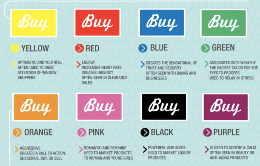
The color of the “Add to Cart” CTA button is also very important. On a product page, this call-to-action button must be clearly visible to people visiting your website.
The Kissmetrics study presents the consumer perception and the area of application according to this button’s colors.
Take note, however, that this isn’t entirely universal. The perception of colors and what each one makes consumers feel can vary depending on nationality. According to the study, here are the emotions, feelings, and evaluations incited by the main colors, as described in more detail earlier in the article:
- Yellow: yellow will pique curiosity, create interest, and give a positive feeling.
- Red: red gives energy and can create urgency; that's why this color is often used for CTA buttons on a business’s website.
- Blue: blue makes people feel reassured and confident about a brand. Blue is also the color most appreciated by both men and women.
- Green: green is often associated with health or the environment. It reassures and positions brands on committed themes.
- Orange: the color orange creates urgency and pushes shoppers to purchase.
- Pink: pink is often associated with femininity and softness, but it also allows brands to differentiate themselves and have more impact in the minds of customers.
- Black: black is minimalist and lends itself to the image of luxury brands or those wishing to position themselves at the top of the range.
- Purple: purple is often used for companies in the field of beauty and wellness products.
What color is the most enticing based on the type of online store?
Finally, you can choose the color according to the specificities of your offer and the profile of your consumers. There is a certain color code to respect! For example, if your offer represents a compulsive purchase related to sales, choose orange, which relates to an aspect of urgency, or red to be able to display your message and make it stand out to your customers. You’ll attract very specific types of consumers. You’ll also be able to, through color, change their buying habits.
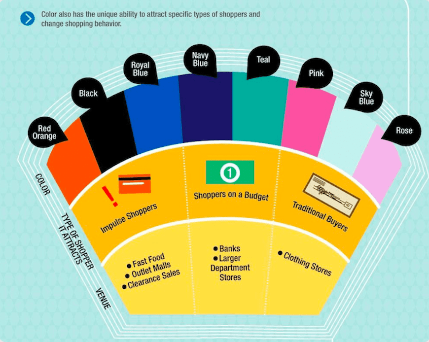
Thanks to your communication and the influence of colors, you’ll be able to transform an internet user’s visit into a sale. The buying experience is then directed by the choice of your colors, which become essential factors of your customers’ behavior. To push your customers to buy, your color marketing strategy must be in line with the emotions you want to stir in them.
In addition, beyond choosing the right colors, you need to make sure that your design and presentation of your site will allow for an optimal customer experience, from the first click to the payment.
Furthermore, too many different colors can harm the readability and consistency of your content. Does your brand have a favorite color? Focus on this tone and try to bring in one, two, or three other complementary colors, not more!