A landing page is a page on your site where the user arrives after they click on a link in an article, an advertisement, a call to action, an email...
The objective is to guide the internet user directly towards the conversion of prospects into customers, i.e., lead generation, rather than simply directing them to your homepage. It’s usually created to support a marketing campaign.
If you’re launching a campaign targeted at an event, product, or promotion, consider creating a custom landing page for better results on that campaign.
A landing page for each campaign will increase its conversion rate. Learn the definition of the landing page, its key characteristics, and all the best practices to create an effective landing page to succeed in the digital campaigns for your business.
What is a landing page?
Definition
A landing page, also called a lead capture page, static page, or destination page, is a specific page of a website on which the visitor arrives after clicking on a link, especially on search engines.
It’s the first thing that the visitor will see while browsing the website via the link that they’ve clicked (commercial link, banner link, email link, etc.).
The landing page is a very important marketing element for any ecommerce business. However, landing page creation and optimization is often an afterthought, a recurring mistake that can start to harm the overall conversion rate of a website.
Why create a landing page?
The main objective of landing pages is conversion: by creating a page dedicated to a very specific marketing action, the prospect lands directly on the information that they’re looking for, in one click, without having to explore a website.
Thanks to the landing page, it’s possible to guide and direct the visitor to transform them into a customer rather than only offering a general homepage.
A landing page is very often created as part of a marketing campaign: it’s then used to target specific keywords that the already qualified internet user will be able to type into search engines.
Creating this type of landing page is then an easy and an efficient way to directly reach the main interest of the qualified internet user to boost your business’s conversion rate.
What is the purpose of a landing page in marketing?
The purpose of a landing page is to highlight key information related to a specific query that a specific target is looking for as well. For example, you could add a landing page in order to invite your visitors to subscribe to your online store’s newsletter, to evoke a single service of your website that will interest only a segment, to respond to a request for a price quote between your internet user and you, to invite them to register for your online conference, etc.
You have to imagine the landing page as an efficient tool for your conversion, to make your activity visible to your target audience, a precious ally in your marketing strategy, provided you know how to configure it in the best way.
How much does it cost to create a landing page?
A landing page is a kind of fixed page that’ll be listed for specific keywords.
Many CMS platforms offer this type of service with more or less efficiency in terms of inserting modules or design ... But you’ll often have to subscribe to a module to insert in the back office of your site. To create an effective landing page in terms of form and content, you’ll often have to use paid tools: a tool like Mailchimp offers this type of creation for a subscription starting at $11 per month.
If you want to use landing pages in your ecommerce business’s marketing strategy, know that with the WiziShop solution, this service is included in your subscription. With attractive design templates and dedicated landing page services, it’ll only take you a few clicks to create your personalized pages and to see them at the top of the search engine results pages thanks to the most SEO-friendly ecommerce solution.
Choosing the right platform is one of the essential components of ecommerce to boost your chances of success in online sales. Enjoy a 7-day free trial with WiziShop and see for yourself why it’s the best solution on the market for your online store!
Try WiziShop free for 7 days
THE EASIEST NO-CODE ECOMMERCE SOLUTION✅ No credit card required
✅ Access to all features
✅ No commitment
SEO, conversion, data... What are the benefits?
- Collect customer data organically
With the help of a landing page, it’s possible to collect customer data more easily because the people who are going to be brought to your landing page will be potential customers interested in the content of this specific page.
Signing up for a newsletter, participating in an online conference, offering a promo code in exchange for registering on your site... It's up to you to be creative to collect as much information as possible from your visitors.
Collecting customer data is above all a way to learn more about your business’s prospective customers, to better anticipate their needs and desires in order to constantly optimize your products and services on your website.
- Optimize your SEO
A landing page is normally configured to reach a set of keywords and precise queries related to its content. New products, new services, an exceptional promotion, service for particular customers, registration proposal, special event... A landing page targets a subject, and this subject is defined by one or several keywords.
Thus, a landing page is made to be reached through search engines, and therefore thanks to work involving your online store’s SEO.
When you decide to create a specific landing page, analyze all the keywords and the semantic field related to the subject of this content in advance in order to always be precise about the SEO work.
- Promote your new products and services
Via your landing page, you’ll be able to highlight a single important message for your online sales site in order to create additional leads.
For example, you can set up new pages for your new products or services, share a guide to inform people about the content of your business’s catalog, or highlight your recommendations and customer reviews involving your products.
After analyzing search engine results and visitor search trends, learn the most promising items and services to create dedicated pages.
- Incite visitors to purchase faster
By highlighting your special offers, coupon codes, sales, or even your registration form to receive a special promotion, you can trigger effective conversion levers.
Convincing, the landing page allows you to direct people directly to commercial content that interests them and therefore to a merchant page on which they’re likely to make a purchase.
In addition, by implementing this type of marketing lever, you can easily play on the impulse purchase created by notification modules: countdown, optimized call-to-action buttons, etc. All the options that’ll encourage internet users to make a purchase are beneficial for reaching your business objectives.
How to create a good landing page: key elements
1. Build interest with a catchy title
As we’ve seen, one of the characteristics of a landing page is to incite visitors to make a purchase by making them want to invest in your ecommerce site thanks to an attractive presentation, design, and content.
The landing page is part of your communication strategy and must be understood as an additional visibility platform for your business to help increase online sales.
As in all your content, the title of your landing page must be catchy.
It must have a real impact in the mind of the internet user, while clearly announcing the marketing offer.
The user who arrives on this landing page is looking for an answer, a solution, or a good deal. Reassure your prospect that they’re in the right place. Be clear and concise.
When it comes to landing pages, short, easy-to-understand headlines have more impact and bring a better conversion rate in ecommerce.
2. Grab attention with a short, neat description
Your content creation strategy when setting up a landing page is based on the relevance of your words, your images, your videos, to invite the user to place an order without waiting.
The more direct you are in the way you approach your special offer, the more likely you are to capture visitors' attention. The key is to stay away from long texts with the objective of favoring the visual side of your modules.
However, to reach its goal and inform potential customers, the landing page must include a short description of the offer you’re proposing.
Explain its value and summarize the content of the offer. Choose words and a tone adapted to your target.
The description will be even more accurate if it’s built with the aim of optimizing your SEO. With the help of tools that allow you to know the essential keywords to position your landing page at the top of the search engine results, you can start to add them to your text copy and craft your paragraphs accordingly to boost the traffic results of your landing page.
In addition to simply making your content attractive to internet users, you'll also need to appeal to Google in order to give your landing page all of its power.
Don't hesitate to consult tools like Google Trends before you build your landing page in order to find out what your target keyword is along with the semantic field linked to it.
3. Remove all external links
Avoid making the user exit the page, unless they click on the back arrow.
To do this, remove the navigation menu from the header to create an effective conversion funnel. Links to other pages leave less chance for conversion.
While external links can be beneficial in an SEO strategy, this type of content may not be in your favor when creating your landing page.
The goal for your user will be to stay on your page so that they can engage with the content you are going to offer them. Subscribe to a newsletter, a promotional offer, subscribe to your social network accounts, use a promotional code on their purchase, request a quote...
Your landing page is going to be configured to invite the visitor to act according to the will of this page. Adding external links, unless it allows you to achieve your goal, won’t be the best solution for this marketing lever.
4. Give to receive
To be able to increase your chances of having your customers convert to the goal you want to achieve, the best solution is to encourage visitors to take advantage of a good plan or a good deal to get there.
For example, if you want to increase your database or newsletter subscriptions, why not offer a coupon code in exchange for your prospect's email address? This can also be done by sending a gift or a sample, for instance. Offer free content or a sample of your product or service in order to collect data from your prospects through a form.
Your generosity will be rewarded, either by transforming visitors into new customers or by retaining your already established clientele.
In other words, make an effort to collect qualified data and increase your emailing database.
5. Spend some time on the call to action
The call to action (CTA) is often represented through a large and visible button on which an action is written, a verb that’ll encourage your customer to click to visit the included URL. Taking the time to provide clear CTAs is an important step in any ecommerce checklist.
By highlighting this type of content, the visitor is going to be subconsciously incited to click, which will improve the user experience, if the content of the button is inspiring and remarkable.
If your page lends itself to it, you can add several CTAs and choose different types of expressions that’ll strike a chord with visitors. Adapt the text of these buttons according to the tone and content of the landing page you create. And this also applies to the colors that’ll make each button stand out from the background of your page.
Prominently highlight the CTA button to convert. Use a catchphrase, always concise and well constructed.
You can also choose to add an action verb to your CTA text and form to encourage people to click and take action. It’s also advantageous to add CTAs to several places on your page.
6. Use video media
Videos are much more meaningful than long speeches! And this is also true for a landing page.
The video format will allow you to gather several pieces of information in an excellent format that’s fun and accessible to everyone. Whether it's for a product, a general presentation, or branded content, the video lends itself to all messages for the benefit of customer conversion.
To highlight the positive points of your products or services, the video can also be made up of different formats to convince future customers. To do this, consider using a clip with several videos of your customers shared on their social networks. This user-generated content (UGC) will bring two types of elements: the presentation of your product, of your brand, and the reassurance lever that the customer review represents.
Inserting a video in your landing page to present your product or service will encourage the interest of internet users who may prefer to view images rather than read content.
Put it prominently at the top of your landing page. According to Digitiz, video on your landing page allows you to convert up to four times more!
7. Structure the formatting
When you develop the description of your offer, remember to take care of the formatting of your web page. In order to make a landing page effective, the best solution is to create very visual content.
Rather than long speeches, long paragraphs, or entire articles published in black and white, the key is to highlight the important points of your message and emphasize all the essential features related to your products and services.
Space out your content and structure it in the form of bullets or paragraphs. This way you create attention zones on your landing page to catch the visitor’s eye.
8. Reassure
In order to effectively convert all prospects into customers, one of the main features of your strategy will be to highlight all the elements that can inspire confidence in your website.
Logo, icon, customer's opinion, etc.: determine the tools and services that will support internet users in order to fluidify their purchase path on your ecommerce site and to present your company in the best way to new visitors.
Always think about the visitors who don't know you: what would you like to tell them so that they have no doubt about the reliability of your company? This is what your landing page must prove with the help of all the elements necessary to communicate your brand and your products.
Use testimonials from your customers to make them feel confident about your offer.
As we know, the majority of internet users consult reviews before buying. Testimonials are therefore particularly important.
Including them is an easy way to bring strong added value to your landing page. Insert your partners' logos at the bottom of the page. Your visitors will be even more reassured.
9. Pay special attention to the design
The design is the priority of your landing page so that it can support your message and all the power of your content. Beyond the general design of your page, you should also think about the presentation of key features and essential information that you want to communicate to your visitors.
By combining fun and memorable templates with the quality of the visuals and photos or videos you choose to integrate into your landing page, you'll check all the boxes that’ll allow your landing page to become memorable.
But before determining the ideal design to get your message across, you'll need to start by carefully analyzing your market and target audience to identify the type of creative and visuals they like, just like when you’re brainstorming for any other marketing action, such as figuring out how to create a newsletter.
Use quality content to reinforce your brand image and improve the content of your landing page.
Keep in mind that mobile is also a primary conversion lever, and this trend is only growing. Think about mobile users by offering a responsive design that automatically adapts to all media. This way, you’ll increase your chances of converting visitors into customers.
Bullet list, product description, promo code, registration form... Make each element an opportunity to showcase your brand.
10. Social networks
Finally, don't forget the sharing buttons on social networks to maximize the virality of your offer. Your visitors will be able to share your pages and offers with their contacts with a simple click.
If you indicate the number of shares, you’ll find that it’s an additional way to build trust for your marketing argument.
Creating landing pages with WiziShop
At WiziShop, we know that it’s essential for you to highlight your content, your products and services, and your added value. That's why we decided to create a special tool, natively offered in all our ecommerce subscriptions. This tool is called Pages+: a high-performance creator to offer your future customers landing pages worthy of your online store.
Pages+: our native tool for creating inspiring pages
Pages+ is a tool dedicated to the publication of static pages and thus thematic landing pages on your ecommerce site.
Intuitive and customizable, this native WiziShop tool will adapt to all types of messages, to all kinds of communication, to allow your visitors to quickly find all the information they’re looking for on your website.
By inserting all the notification modules available to you on the tool, you can boost your chances of converting your visitors into customers.
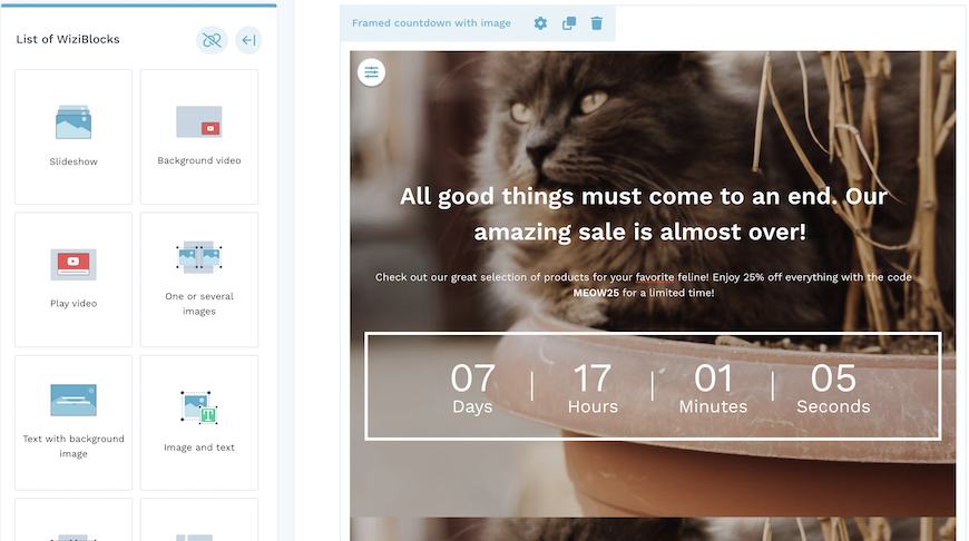
Free-page creation is configured with our unique WiziBlocks system: by clicking and dragging each block, you can customize your page endlessly by adding all the modules of your choice in the places of your choice. Slideshow, video, form, product list, social networks, testimonials, FAQs, etc. Dozens of solutions are available to you to create and edit your custom page and enhance your offer.
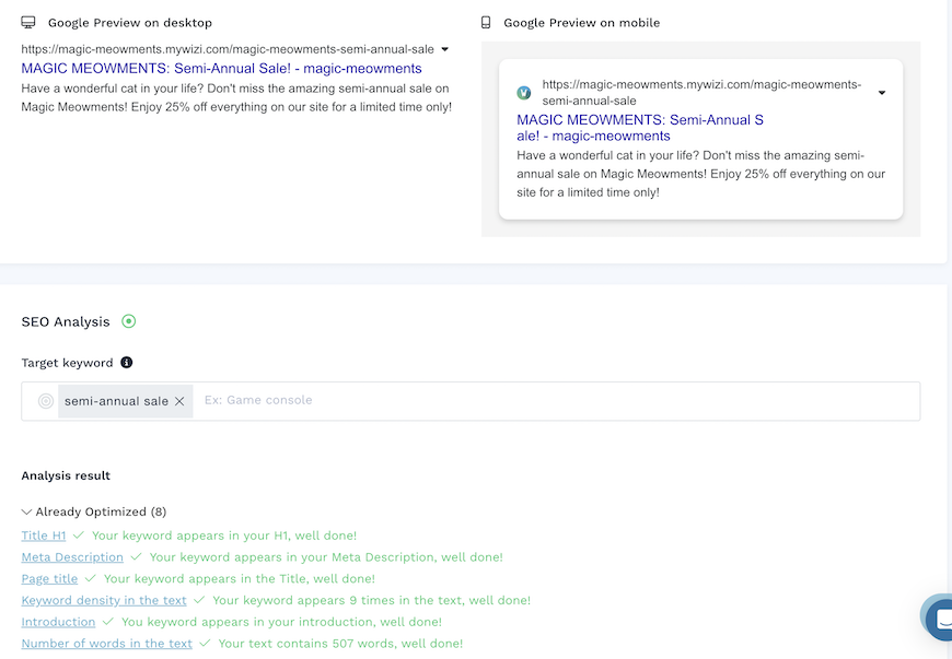
Of course, with WiziShop, SEO is at the heart of the configuration of this type of page: the analysis tool integrated into this module informs you about the degree of optimization with respect to your target keyword.
Different parameters and settings are highlighted in order to check all the boxes to ensure that your landing page is optimized for search engines. URL, meta title, meta description, Hn tagging... The tool lets you know in real time if all the added elements are set up in the right way to boost your visibility on Google.
Preview, and then save and schedule your future landing pages to manage your communication strategy like a pro!
The creation of these custom pages is included in your WiziShop subscription. Test the solution during a 7-day free trial and start setting up your thematic landing pages.
Try WiziShop free for 7 days
THE EASIEST NO-CODE ECOMMERCE SOLUTION✅ No credit card required
✅ Access to all features
✅ No commitment
Sample template with Pages+
Before leaving you to start to set up your own pages, let's have a look at an example of Pages+ template: here minimalist, your proposal can be loaded with colors and modules according to your company and your brand.
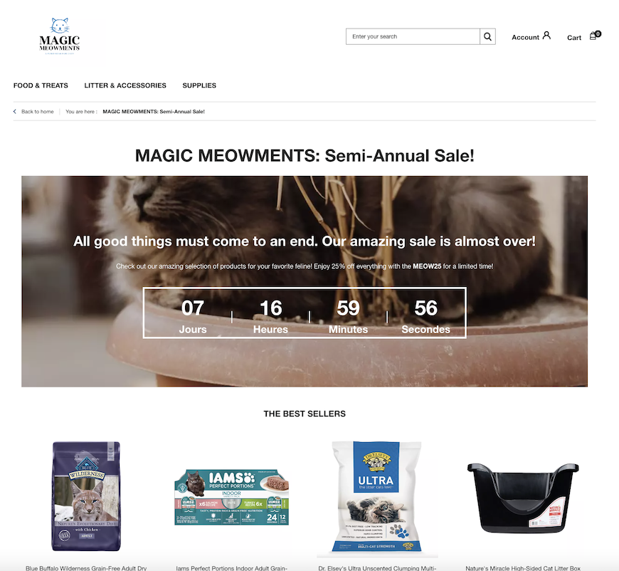
This tool is a blank page on which you can let your imagination run free: enhance your brand without delay!


