On the web, navigation between pages must be fluid and coherent to accompany and guide the user as best as possible. The breadcrumb trail is one of the main elements to provide visitors with indications regarding their position in the site.
Mostly used to improve the user experience, it’s also very beneficial for your SEO!
Discover a complete presentation of the breadcrumb trail and the different benefits of this navigation element in this article.
What is the breadcrumb trail on a website?
Also known as “breadcrumbs,” the breadcrumb trail, by design, is a secondary navigation pane that displays pages of the site, generally respecting the tree structure of the site.It’s a small text path that’s usually located at the top of the page and indicates to users where they are on the site.
It’s a small text path that’s usually located at the top of the page and indicates to users where they are on the site.

Through breadcrumbs, the user can also click on the different elements to go back to the previous level, the previous page, or the homepage of the site.
It also plays a role in SEO optimization for search engines such as Google and therefore shouldn’t be neglected!
Origin of the phrase “breadcrumb trail”
The phrase “breadcrumb trail’ echoes the German tale of Hansel and Gretel. In the story, the heroes scatter small breadcrumbs in order to find their way home.
The idea is to follow a logical path to get out of a situation in a victorious way.
Today, this is precisely the main function of the breadcrumb trail on a website. Its objective is to help web users find their way through the many pages of a site.
The different types of breadcrumb trails
Breadcrumbs are a valuable visual aid for the website visitor. They provide contextual information that helps visitors know where they are and where they can go.
The idea is to highlight the structure of the site so that it’s more easily understood. They are, in a way, a second complementary menu.
However, there are several types of breadcrumb trails.
Classic and static breadcrumb trail
This breadcrumb trail is based on the standard tree structure of the website. In this case, it follows the exact structure of the site while respecting the hierarchy of the pages.
This type of breadcrumb trail is the most commonly used design. It’s particularly effective with users who enter the site via deep pages. It allows you to know exactly where you are and to move to higher levels if necessary.
It’s also the one used on all the stores created with our ecommerce solution, WiziShop.
For example, for an ecommerce site, it can be presented as the following: Home > category > subcategory > product.

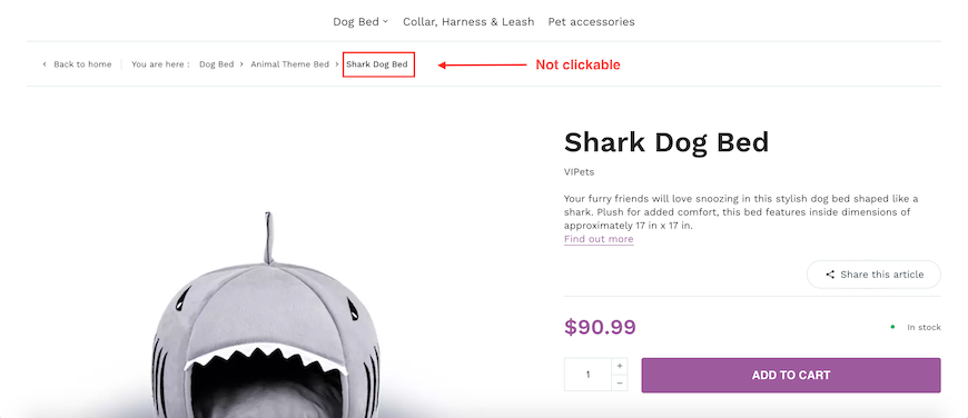
Example on a WiziShop store: Home > Dog Bed > Animal Theme Bed > Shark Dog Bed
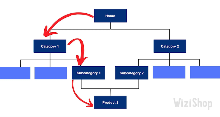
Dynamic breadcrumb trail based on the user path
Breadcrumbs can also be dynamic. In this case, the breadcrumb trail is based on the visitor’s path and browsing history. It evolves according to the user’s behavior.
If you choose to use it, be careful not to lose your visitors.
It’s not uncommon for them to move from one page to another, without following a logical path. In this case, it gives rise to breadcrumbs that are more vague, almost incoherent.
Furthermore, this process has little interest for users who enter your site via a deep page.

Home > Category 1 > Subcategory 1 > Product 3
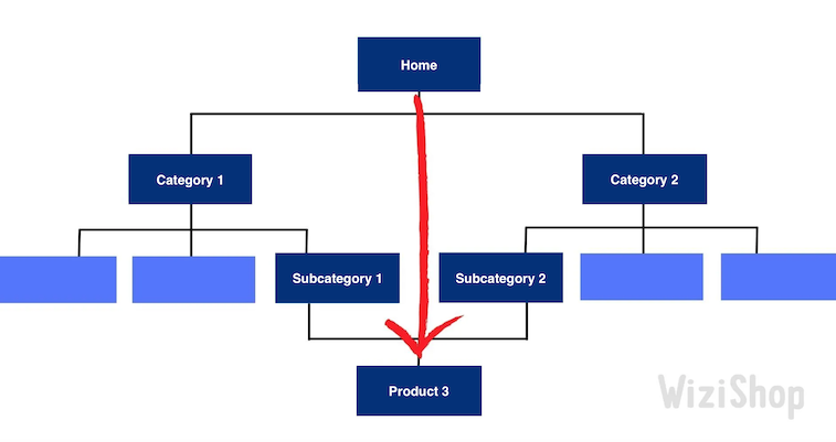
If the person takes another path, the breadcrumbs will adapt:

Home > Product 3
Static breadcrumb trail with dynamic attributes
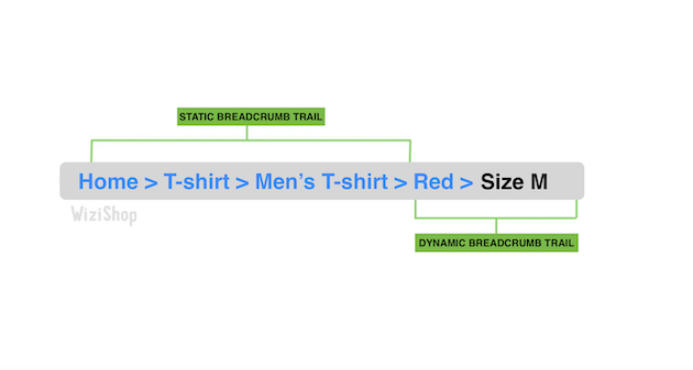
Particularly useful for ecommerce sites, there’s also a static breadcrumb trail that includes the attributes selected by the user in a dynamic way.
More complex to set up, it’s particularly relevant and built according to the structure of the site but also according to the user’s choices. It’s based on the standard tree structure but also adapts to the visitor’s selection.
For example, if you sell clothes and you have size and color filters, a static breadcrumb trail with dynamic attributes might look like the following: Home > T-shirt > Men's T-shirt > Red > Size M.

The benefits of breadcrumbs on a website
This element has many advantages, both in terms of SEO and user experience.
Better exploration of the site by search engine robots
Search engine crawlers, such as Google’s, particularly appreciate websites with a well-constructed breadcrumb trail. Through it, they can more easily explore your site’s content and the different URLs.
It can also appear directly in search results when you specify it in the BreadcrumbList element of your source code.
For more details on this integration, here’s the Google documentation.
On WiziShop stores, this structured data is automatically generated to improve the display in search results.
This is a way to entice users to click on your site.
Smoother navigation
The breadcrumb trail appears at the top of each page. It’s a very reassuring and intuitive element for the user.
Thanks to it, visitors know exactly where they are and can easily return to the previous page. This improves their browsing experience, which is especially crucial in ecommerce.
When your structure is clear, it’s an effective way to guide your visitors to another part of the site, even if it doesn’t correspond to their initial need.
If you’re used to browsing the web, you probably know that the “back” button doesn’t always lead to the previous page of the site. With breadcrumbs, internet users are guided in a precise way, and the number of actions that they must perform to get to a page is reduced.
Although the breadcrumb trail only occupies a very small space on the page, it’s very useful!
Better conversion rate
Even if users don’t necessarily click on the links present in the breadcrumb trail, its mere presence reassures the site user. This encourages visitors to stay longer on your pages and to navigate more fluidly.
The browsing experience is very important in the purchasing process. Breadcrumbs therefore play an indirect role in converting your visitors into new customers.
Optimizing internal linking with anchors
Finally, the breadcrumb trail is a way to create an internal link between the different pages of your site while taking advantage of optimized anchors.
As a reminder, anchors are represented by readable and clickable text with a hypertext link.
The words present often represent the target queries of the page. These anchors therefore reinforce the theme of the page and contribute to improving the SEO of each one.
The location of the breadcrumb trail at the top of the page, often above the fold, also gives it a place of choice to convey maximum power.
How to optimize your breadcrumb trail for SEO
So, how do you get perfectly optimized breadcrumbs for your website?
Complementarity with the site’s menu
In no case should your breadcrumb trail replace your site menu. It’s complementary and not a substitute.
It will not replace the navigation performed in the traditional way by the main menu. It simply improves the user’s comfort.
In other words, although breadcrumbs are important, don’t make them the main element of your page.
Presence of all the pages of the site
Breadcrumbs should show visitors all the way from the homepage to the page that they’re on. They shouldn’t skip any elements.
Thus, the breadcrumb trail must provide an obvious path to the user, a path that should span from the first page of the site to the one where they are at the time of navigation.
Presence of coherent and adapted link anchor
The clickable words in your breadcrumb trail must be consistent with the landing page.
As I indicated to you above, this element makes it possible to help reinforce the semantics of your pages, so you need to take advantage of it!
For example, if your category page targets 40-inch TVs, put “40-inch TV” in the breadcrumb trail.
The last step must not have a link
The page the person is currently on can appear in the breadcrumbs, but it shouldn’t be clickable.
If you want to display it, only the text should be present. Since the visitor is already on this page, they have absolutely no interest in being redirected to the place where they already are...
This is why the last link isn’t clickable on WiziShop stores.

Check that the elements present are consistent
The breadcrumb trail must be a consistent element, both in terms of path and design. When the person clicks on one of the links, they should be redirected to the right page.
To be sure to avoid errors, you will want to consider checking your breadcrumb trail, navigating both up and down.
In addition, the path it displays should seem logical. To make it clear and understandable, each level should be separated by a symbol. In most cases, the “greater than” sign (>) is used. Some sites also use arrows (=>) or slashes (/).
The size of the breadcrumb trail should also be consistent with the rest of the site. The design of this tool shouldn’t be too imposing, but it shouldn’t be too small either.r
Your users should be able to find the breadcrumb trail easily, without it being immediately obvious to them.
In fact, the breadcrumb trail should remain visible, but it should still be more discreet than your main menu.
In this sense, try not to use too fancy of a font or color for your breadcrumbs. It must remain simple.
The breadcrumb trail is omnipresent on the web. Especially useful for online stores and optimizing ecommerce SEO, it’s an essential landmark for users that also facilitates accessibility to search engine robots.
Optimized breadcrumbs can help to improve user experience and SEO. For this reason, think about implementing these best practices on your website.


![Keyword research tool: 11 of the best free and paid tools in 2026 [+ Bonus!]](https://wizishop.com/media/61db2a7e5bab8a085f2c7e8b/v1/keyword-research-tool-wizishop.jpg)


